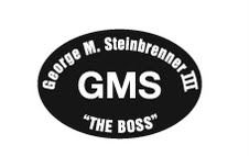
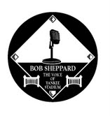
 As I mentioned I was at aiports all day where AT&T’s 3G ain’t so reliable (can you tell I am annoyed?) and I missed this one because – oh let’s see why – oh yeah because I couldn’t get on the internet.  Anyways…Chris had my back and sent this over. I think it’s a classy move.
This Saul Katz person exists. You never hear anything about him. He’s like the Secret Owner. One of these days I’ll have to dig through the media guide and study up on him.
While Chris was sending it over, he had some thoughts…it’s a good rant that reminds me of myself ta my most frustrated. Here’s Chris:
Hey Shannon,
Just a little thing bugging me this morning…
Last year, much was discussed about how pathetic the Mets’ Citi Field patch design looked – even comparing it to the Domino’s Logo (yes, I still see the Orange and Blue of the original Citi Field logo when I see Domino’s commercials.) That patch was the grand result of something two years in the making, the opening of a new ballpark and the beginning of a 20-year partnership with one of the world’s largest banks…it was even put together by people in the world’s marketing and advertising capitol!
However, last night the Yankees released their designs for patches to be worn on their jerseys to honor “The Boss†and “The Voiceâ€. The attached images of these patches pretty much sum up my argument; the Yanks had a simple, yet thoughtful design released within 24 hours of the news about George. Additionally, in my opinion, the tribute patch for Sheppard is the best I have ever seen on a jersey (and not even for a lost player or former player but for a voice.) The design of the Sheppard patch had an unfair advantage over the Steinbrenner patch as it was able to be planned out since Sunday, a whopping THREE days earlier.
When the Mets released their original Citi Field patch and were forced to step back and announce the “secondary patch†(which I love on my blue hat and would have liked to have on the jerseys for last season), they showed how little attention they pay to detail.
While I may be nitpicking here, I had to report to the “Police†that once again the Yankees showed the difference between themselves and everyone else…they KNOW what they are doing without having to follow the public opinion and KNOW they will end up looking good in the process. If only our team could keep it simple and get the easy things right, they could spend less time on damage control and more time on the things that matter!
Keep up the great work!
Chris
But Chris wasn’t done.
As a follow up, I was just reading the Daily News Steinbrenner pullout and took notice of all the ads from various businesses honoring George…one of the ads is from the Mets.
After seeing the “We Believe in Comebacks†ads and the other media they have used this season, I guess the Mets really did fire their former design firm or employees. Their ad in the paper today was very tastefully done with a darkened NYC skyline and a message “…saluting the legacy and memory of a New York sports icon.†I also liked the fact that they kept their logo (and Cyclones logo) small and aligned to the very bottom of the ad, away from the real message and the bold “George M. Steinbrenner III.â€
Contrary to my previous email applauding the Yanks and “dissing†the Mets, I must say this time that this was a great job and a thoughtful tribute from the Amazins.
-Â Â Â Â Â Â Â Â Â Chris


Bah. Still seems to be missing something.
The Citi Field Patch was likely designed by Citi. It’s part of the 400million. Just something we’ll have to live with. It’s the “official” patch of Citi Field, and it’s still in play today, just not on the jerseys. The other logo I like better, and was the one that was probably designed by the Mets.
Additionally, Citi’s patch couldn’t actually say Citi on it, which probably had something to do with the design.
I don’t really like either of the yankees patches. They’re too busy. Certainly not simple. Isn’t the whole point of these patches that they’re such icons that they don’t need explanation? Why does it say George M Steinbrenner III across the top? Just in case we don’t get what GMS stands for? And how many things did they fit in that Sheppard patch? diamond,microphone, two fences, and whatever that little logo is on the bottom. I suppose I can reserve judgement until I see them on the uniforms in play, but with two patches, and two busy ones at that, I can’t see how it’s going to look good. Polka Dots instead of Pinstripes..
They’re much busier than anything the Yankees have ever done — usually just black arm bands or the uniform number. And they’ve only ever worn them on the sleeves, so by putting the GMS one above the NY makes an already gaudy design even more so, in my mind. The Sheppard one is classy, but again, more than they usually do. Neither really fits with the classic simplicity of the uniforms.