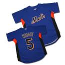
If the Mets do get the 2013 All Star Game I’m a little worried about the All Star jerseys.
Maybe I’ll get my wish and the Mets will drop BLACK for the 50th season in 2011, but assuming they won’t because you know, black sells – it’s not winning, it’s black….
DIGRESSION TIME. Â SOURCE: THE WASHINGTON POST July 12th:
According to MLB:
* More than 78,000 Strasburg jerseys were sold through July 1, making his the top-selling Nats jersey of all time. Yes, in one month he outpaced the entire career of Ryan Zimmerman for jersey sales.
Let’s see…the Nationals…what do they wear again? Â It’s black isn’t it? Â Yep, the Nationals sell lots of black Strasburg jerseys.
Anyways….I worry that the All Star Jersey could look clownfish if they have blue and orange and black. Â You know how MLB loves to do that crappy underarm color nonsense (please stop. Â please.) Â We could have a real mess on our hands.
If I invent the holodeck in time and find myself in charge of the 2013 All Star game I will propose that the NATIONAL uniform be Mets WHITE and the AMERICAN wear blue. Â No black. Â No underarms. Â I’ll actually suggest there not be All Star jerseys but I’ll lose that fight.
See this jersey below – imagine it with NATIONAL across the chest. Â This is what I fear.
I also worry that Mets Font might look bad spelling out AMERICAN. Â Then again maybe it won’t.
If you’re bored and good at photoshop get crackin’ Â Let’s see some 2013 All Star Game designs.
By the way, I’m looking forward to the Mets having home field advantage in the 2010 World Series. Â And can Flushing have the All star Game already please. Â The Bronx has had it twice and Anaheim like 3 times. Â Even stupid Cleveland had it twice since 1964. Â This is New York, there’s plenty of places for the bigwigs to schmooze and do whatever it is they do at these things. Â Even the NFL figured that out.


I had a quickie version of the logo on yesterdays Apple.
http://1.bp.blogspot.com/_sPdtXAlddJE/TD8L6-74IBI/AAAAAAAAAUc/RKCaV-rjryI/s1600/2013.jpg
link
Just keep Citi out of designing anything.
I think one side will be orange, and one blue. Orange will probably look a little silly, so throw that to the American League.
What if the American League Jersey used the Mets Road Font?
Thinking about the color scheme now I am getting flashbacks to the incredibly hideous Orange BP Jerseys from awhile back.
My guess is the jersey colors will be similar to what the Yankees had when they hosted the ASG. National League will wear royal blue with some sort of orange and ::sigh:: black sprinkled in while the American League will wear Grey jerseys with predominately blue and orange sprinkled in.
You guys better stop hating on the black or you just might get your wish. The Mets will drop the black in 2011 and replace it with powder blue or pink.
i wouldn’t bank on a white jersey. these BP jerseys are paired with the team’s regular pants. so by doing a BP jersey in white, you’ll be mixing and matching with other white pants, some of which will have pinstripes. it’s not without precedent however. from ’03-’04 (chicago and HOUSTON of all places), one league wore white, the other black. made sense for chicago (because it’s the chi sox color scheme) but not houston. they went back to team color schemes in ’05 and haven’t used white since.
speaking of ’05, detroit used orange and made the NL jerseys orange. it wasn’t terrible. granted it was a more burnt orange than the mets’ brigther orange, but it still looked pretty good.
What if they merely modified the Mets jerseys for this. In other words, National League jerseys would be either pinstripe or snow white with “National” across the chest in the Mets script, while American League jersey could be grey road jerseys with “American” in the same font used by the Mets on their road jerseys.
Alternatively, blue jerseys for NL and black for AL.
With respect to the patch, isn’t there some sort of requirement that the logo from the hosting team be on there? I’m not sure that merely using the Citi patch would do.
Well, with any luck the jerseys will be completely different from the ones we’ve seen the last few years. Majestic is supposed to be redesigning the BP jerseys for 2012 at which time we’ll get a new BP cap as well.
I am personally hoping for a return to the full button-down style and I know I’m probably in the minority here, but I really liked the orange jerseys they wore in ’04.
Agree with full button-down, strongly against the pumpkin jerseys of ’04.
For one thing, I think the All-Star Game hasn’t been in Queens because the Mets haven’t asked for it. As for the jerseys, I’d expect blue and orange. They rarely do script lettering for “National” and “American” (I think Detroit was the last, maybe only, one), but I think that would be an interesting alternative. Otherwise, it may very well be the same font as the “NEW YORK.”
http://www.sportsauthority.com/product/index.jsp?productId=3600458&CAWELAID=356685634
St. Louis had the script in 2009. Every part of the uniform is based on the teams home uniform. They will figure a way to make it work. I kind of think it will be Blue and Orange for the uniforms and they will make it work in some way
I wouldn’t mind seeing blue jerseys for the home team and grey for the away team like the Yankees did two years ago. I think they looked sharp and classy. Throw orange accents into it and I think they can make decent looking All Star Jerseys.