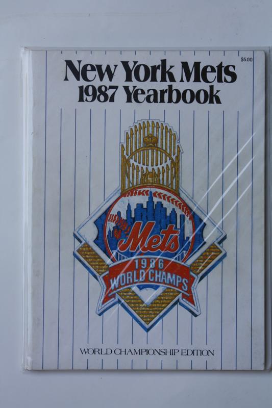
I think everyone knows where I am heading right now. Â Keep an eye on the tumblr (orange section of the main page, or metspolice.tumblr.com for the rest of you) for updates throughout the day.
I have been going in sequence with the Mets yearbook covers (from Angel’s collection) but today I thought I’d skip to this one….from 1987
Thanks to Doc, Darryl, Frank and Davey for helping make it possible.
Why the hell did the Mets take the NY off the ball logo anyway? Â I still think they are moving to Mercury in 2021.

Come on, Shannon, we’ve been through that “NY” thing before. 😉
http://www.villagevoice.com/1999-10-12/news/uni-watch-mets-concede/
UniWatch has a little more background on it here (text search for “logo fossil”):
http://www.uniwatchblog.com/page/168/?image=1164091991
In a nutshell, the original logo had an “NY” more similar (though not identical) to the one on the caps, but time proved such a tiny detail impractical and the serif-thingys just kinda disappeared over the years, leaving the logo with the stick-figure “NY” you see above. In ’99 the Mets considered trying to make it match better, but ultimately decided it wasn’t worth the effort and just dropped it altogether.
I think they made the right call. Most uses of the logo are so small, the “NY” just ends up looking like crap anyway.