Shannon,
Since Dana has given us some insight into the Mets possible plans for their 50th anniversary, I think we should look back to their last anniversary celebration for the franchise’s first season.
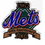 In 2002, the Mets celebrated their 40th anniversary with a sleeve patch worn for the entire year on their right sleeve. The patch was fairly understated. Simply designed and effectively done. Can’t say I’m in love with any version of the three toned script, but the blue/white/orange is certainly the least aggregious of the variations they could have gone with. As we all know, sleeve patches can be much, MUCH worse (I’m looking at you, 2009 Inaugural Season patch)!
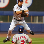
The Mets broke out their ’86 throwback uniforms (I believe) twice at home at Shea. If I’m not mistaken, these were worn for two series during the summer. Here’s Mo Vaughn rocking the look.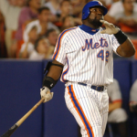 Yup, he can make just about anything look bad. While Mo and the ’02 crew didn’t duplicate the magic of ’86 in them, it certainly was nice to see. Personally, I’ve never understood the Mets aversion to throwback weekends or dates. Teams like the Padres, Brewers and Mariners have been using them very effectively in recent years. Here’s to hoping we’ll see some throwback games on the calendar in 2011 or 2012.
I should note, the Mets last throwback uniform game was for the August 18-20, 2006 series (SWEEP!) against the Rockies, when the team celebrated the 20th anniversary of the ’86 championship. It’s a fun thing to do. And I for one know that the Mets clubhouse shops and stadium team stores couldn’t keep even the authentic throwbacks in stock. I have a David Wright one and cherish it as one of my favorite jerseys to date.
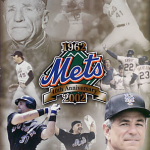 As we see on the cover of the 2002 yearbook, the Mets gave a little nod to their history. They also did so by refacing the Loge level at Shea at season’s end, adding graphics from great Mets moments of the past: a change that lasted until the final game in 2008. We can also see that they were in full black obsession mode. Look how the past transitions into the bold new future of….shades instead of colors. Kind of weak, but nothing that a blue cap and some graphic design tweaking couldn’t save.
Overall, a decent effort, but I hope we can see much, much bigger things for the 50th. It really seems the Mets are starting to get it, so I’ll hold out hope for the complete elimination of all black uniforms and accents from the organization, an old timers’ day, fan fest, throwback games, a quality sleeve patch….the works. Let’s do this right!
Wow, thanks! Now that’s a guest post! (Hey Osh, when we getting another in the uniform series?)
I know I’m like a 5 trick pony but I’ll go to one of my tricks yet again and wish that in 2012 they revert to the original uniforms.
Don’t forget Dave, win the World Series in nice uniforms and I go away!
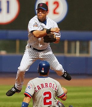

I’ve become fond of the ’87 cursive ‘New York’ gray away Mets uni and the home uni of that era. They were eyesores, but somehow those unis say ‘New York’ to me, with the blue and orange and, let’s be honest, this town isn’t something Martha Stewart could have concocted.
I also dig that those unis were designed by Petruccio, who rocks this Mets blog with his diary/art: http://mymetsjournal.blogspot.com/
If they were to wear those unis, but not lose the skyline patch (which is a true baseball work of art), then I would be satisfied.
i think the racing stripe unis had their day in the sun, and that’s where they should stay. however, everyone loves throwback games. it’s a great source of merchandising revenue, it’s fun and even the players get into it. with the 50th coming up (and in an effort to get some people into the stadium this year) what about throwback fridays? one friday night per month, don a different uniform from a certain era. you can change the graphics to make the jumbo screens old school-looking, yo ucould play music from that era on the PA, invite some alumni from that specific era. i think it’s a winning idea.
for the current uniforms, pinstripe (sans black dropshadow), road greys (sans dropshadow and hybrid cap) and a blue alternate. let’s face it: most teams wear an alt and the mets will be no difference. we already know they keep the black because they claim it “sells better,” but it’s my conjection that alternate jerseys sell better period. the consumer isn’t attached to the black, they just want a solid color jersey that breaks from the norm. blue with orange piping and and orange mets script outlined in white would do just fine.