Look at this picture.
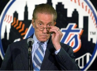
It’s great yet horrible.
It’s horrible in that it stinks that Madoff ruined people’s lives. It’s horrible that yet again people are talking about the Mets negatively. It’s horrible that yet again we are talking about off field drama.
Yesterday I tweeted @metspolice that the devil you know is better than the devil you don’t. Sure things haven’t always gone that well in Flushing, but I would worry about the Dolans aka Cablevision or GiganticCorp coming in.
Even a Mark Cuban type is fun if you are a blogger or a sports talk host, but is that the kind of owner that let’s the baseball people do their thing, or does that wind up being Steinbrenner at his 1980’s worst.
The photo is also horrible because of the black Mets logo. Awful.
…
I think this is THE topic right now so I’ve parked a few of the random posts that were scheduled for today (and yesterday). I’ll also extend King of Piazza by a day or two.