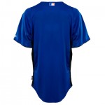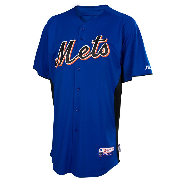
Behold the 2011 Mets Batting Practice Jersey

If there must be underarm stuff the black looks better than the orange would (yeah I said that).

Very disappointed about the black Mets for reasons much discussed.

Not what I wanted, and I want to see how the numbers look on the back, but I’m not ready to hold a protest in Flushing.

16 Replies to “Behold the 2011 Mets Batting Practice Jersey”

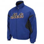
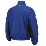
  1. I think that the BP jersey could have been MUCH worse (see orange Mets BP jersey circa 2003 with Mo Vaughn wearing it). Also, all is not blue in the collection as the 2011 jacket is available in both mostly blue (as you’ve shown) and mostly black – http://shop.mlb.com/product/index.jsp?productId=4367766&cp=1452359.1452832.1665574 – and the BP jersey matches the BP cap from New Era very well – http://shop.mlb.com/product/index.jsp?productId=3875093 .

          1. They offset the BP cap and jersey changes, with versions lasting a few years at least.

    1. They switched the black jacket to being the road version. opposed to being the home version for the last few years

      1. Any idea if that was Samuels idea of if it came from on high? Will new Equipment Manager continue this?

  2. Not surprised, given the change back to the blue dugout jacket back before christmas. I expect the BP numbers to also be black, outlined in white, with orange dropshadow. Just like they are now.

  3. At least they’re going with a unified look with the jackets & bp jerseys. As long as black remains one of the team’s three official colors, this is probably about the best we can expect.

    1. I view the elimination of the orange “pit-stains” as a vast improvement.
      I do wonder if the Mets will have a road BP jersey, like the Yankees. If so, I would not be surprise if it was black w/blue side panels, like the road dugout jacket.

      1. Majestic Athletic just stated on facebook that there will only be this version of the Mets BP jersey, no separate road version. Also, jersey will have name and number on back, ans no TV number on front

  4. I don’t mind black trim. I can even deal with an alternate black jersey.

    But for the love of all that is good, stop with the black writing on blue. That is butt-ugly. And I say despite owning and frequently wearing (because it’s just so darned comfortable) a 2006 BP cap of that very scheme.

    At least the ChiSox decided to go black in the late 80s or whenever it was, they had the stones to just change the team colors altogether instead of going this half-assed route.

  5. Now if only they will change the batting helmet to match the cap they are using for the game instead of those horrid “BP to Black” ones they use when wearing the hybrid cap…

Comments are closed.