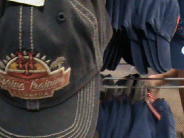
Some more alternate Mets caps..spring training style
2 Replies to “Alternate Mets Caps: Spring Training Compilation Part 2”
Comments are closed.
What Mets fans talk about when not talking about the actual games.

Some more alternate Mets caps..spring training style
Comments are closed.
The hybrid looks great! They changed the NY logo so that you can actually see it. Wish they had this for the actual one they wear on the field (but would still prefer that they have a primarily orange NY with the blue surrounding it).
I can’t see why someone would want such a time period specific cap, especially for an event as benign as Spring Training. But hey, I guess people buy them.