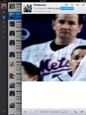
19 Replies to “Mets fan wears underline jersey to Nats game”

  1. Ah…the underline…the only thing they have done stupider than the black. To wear one is to have no shame.

      1. actually…the BFBS is worse, but the fishtail is stupider

        we were pondering how bad it would have been if they had a BFBS jersey with the swooshie…

  2. not only is it the ‘swoosh’ it doesnt even look like it’s a real one. T-Shirt looking material. oh the humanity

  3. We need a Lukus or Lukus-like piece about this debacle. As I remember it was by some hotshot female designer who did the Marlins originals and the Mariners makeover. We got the worst of this deal.

  4. guy stayed for all 9 innings, and i don’t think i once saw him leave or absent from his seat (and you couldn’t miss him since he was in every shot with a right-handed batter) … musta had (at least) 3 brewskies too, because his cup was full/empty/half full in different innings

  5. I’ll admit it.

    I like the Swoosh and if I find a XXL Jersey I’ll get one !!

    Now I would not however wear the one orange arm jackets we had in the past or the painters hats .

    LGM !!!

  6. I liked the underline/”swoosh” road jerseys better than the home, although they would have looked better without the white outline.

    The “swoosh” home jerseys weren’t offensive, just unnecessary. There was no need to re-do the Mets script, that the underline itself just didn’t look right on the jersey.

    The Mets got it perfect in 1995. There was never any need to futz with it after that.

    1. I liked the road versions and actually do have one from 1993. The ’94s were better since they didn’t have the sleeve cuff, though.

      The underline is debatable, but I always really liked that particular script because it mirrors the “Mets” script, as finely illustrated here:

      http://www.faithandfearinflushing.com/2008/04/14/homerdog-jpg/

      The old/current Giants knock-off lettering is great, but given the choice, I kinda almost prefer the matching cursive.

      The ’87 road script sucked. It was too thin, and that oversized lowercase “N” just looked dumb.

    2. Almost perfect…the white outline was annoying in that it took away from the orange outline. The only other quibble I had was the road jerseys in 95 should have had varsity numbers on the road, not block.

      1. I didn’t mind, or really even notice, the white outline on the home jerseys, although I agree they would have looked slightly better without it. The road grays from 1995 on had no white outline, something I had never liked about the previous road grays.

  7. Those 93-94 Mets Home ‘swoosh’ jerseys also had very thin pinstripes on them, not the thicker ‘zig-zag’ pinstriping they have had for most of their history. I think the only teams that have the thin style now are the Phillies, White Sox, & Twins.

    When Gerry Cosby used to have the store in the Garden, they always had a Rico Brogna swoosh home jersey hanging from the rafters. I think that jersey was up there til the late 90’s or early 2000’s.

    A few years ago I stopped by the relocated Cosby’s (very tiny) and saw a home pinstriped Mets jersey on the rack w/the white outline from 95-97…didn’t have any $$$ at that time to pick it up.

    1. If I could find a ’95-97 road jersey (in my size, with no name and number on it), I’d snap it up in a blur.

      1. I actually have a modified ’95-97 Mets Road jersey that I bought from the now-closed Mets Clubhouse Shop in the Menlo Park Mall in NJ.

        I modified it to look like a Tom Seaver ’72-’73 Mets Road Jersey by removing the piping off the sleeves. However, I botched up the numbers on the back…I guessed them ‘2 inches bigger than normal when I dropped it off at the sports shop to be sewn on…the 41 now looks like it belongs on a football jersey!

  8. The “under line jersey”logo was printed on the mets scouting report cards in 1965.

Comments are closed.