Let’s discuss Mets blue

Hi Shannon,
I’ve been thinking, nevermind the discussion about the black, let’s talk about the blue and the orange.
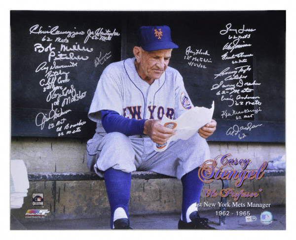
Take a look at this old pic of Casey in a Mets uniform.
Let’s talk about the blue.  It’s a royal blue, not a light royal blue.
Let’s talk about the orange.   It’s muted, not as much red, not so bright.
The bright orange blue the Mets wear is so counterposed and bright as to be nearly impossible to wear w civis, or even to look at on the field.   If they just went back to Dodger blue and a cool orange, rather than highway warning sign orange, then the regular hat could be the civi hat.
Also, w the Red Sox and Yankees going from navy to midnight navy, the Mets have room to steal on the darker side of blue.
Whatchathink?
15 Replies to “Let’s discuss Mets blue”

  1. I love the Mets current palette. The shade bright blue is fantastic. It’s perfect, it just needs to be seen more.

    It definitely seems lighter or brighter than in the distant past, but modern televisions also display these colors much better. The Islanders and Rangers both seem to have brighter blues too.

    In any case, for the Mets any medium blue that’s miles away from black makes me happy.

  2. The Mets blue has changed so many times, it’s hard to say what looked best. Most of the changes were likely unintentional…sloppy year to year changes in uniform manufacturers. Then you have hats and jackets that may not match exactly either.

    I am now going to imagine I am in charge …(initiate wavy dream sequence)…The original blue looks great…I also like the blue from the 1982 road alts. I would borrow it from the Met Hall of Fame and standardize on that color. Then I would restore the uniform wordmark away from the Wilpon version. The Dodgers had to do this a few years ago also, as over the years different manufacturers made slight unintentional changes that caused inconsistencies. For the sleeve patch, I would again march into the Met Hall of Fame and have someone duplicate one from the 60s exactly, including the little NY. Get rid of the orange button cap and we can now turn attention to the uniforms.

    Black is of course eliminated. Casey looks great above and I would duplicate that road jersey exactly, including the thick varsity font with serifs. I don’t think a road alt is needed. A blue version of the traditional jersey existed as a road BP jersey in 95-97, but does nothing for me. Perhaps it was the gray letters with orange outline…never liked that. Maybe try a blue road alt with orange writing and gray outline.

    For the home jersey, we need the traditional pinstripe of course. By no means will the lettering have an extra white outline…blue letters will have a thick orange outline only. I would absolutely have a blue alt, again, I like the 1982 alt as a model. That’s about it.

    1. How soon can we put you in charge?
      I won’t quibble at all with your designs…No black in sight – Makes me a happier Mets fan!

    2. I agree w you:
      1) the wordmark has gotten sloppy and weird: what’s with that?
      2) the skyline arm patch has gotten weird, the threads don’t reach the end of the logo, they’re sketchy, … isn’t anyone over there observant that the image is coming apart?

      As for the exact colors, Petruccio’s website, where he displays the original design he made for the 1980s unis, shows the actual Pantone color in use, 287 for the Mets I recollect, which is less towards cyan than the Dodgers’ blue.

      Blue leaches pretty easily, so it’s debatable the exact blue that was worn in the 60s, imho. They can photoshop the blue back in. As for the Mets ‘museum’, there is a 60s hat which looks a shade darker, but whether it’s the same values relative to blue and green, I don’t know.

      1. Greg,

        The sloppy wordmark is the dreaded Wilpon Script. BTW, in the “good” patch on the left in the articles’ photo, the Mets wordmark is too far left and is not centered properly. We just can’t win.

        1. How about this, going back to the 62 uniforms?

          * no numbers on the front
          * no names on the back (to the extent the league allows it)
          * no sleeve patch on the home uniform

          1. The numbers don’t detract from anything…they are fine. If the sleeve patch is done right, I love it.

            Names don’t bother me either…used to them.

  3. nice work!! I agree 100% …. that uniform on Casey looks perfect. The old blue and the real Mets orange is a perfect combination. No black needed at all.

  4. They’ve now lost three in a row, including two in a row with the non-blacks. My bet is on the black unis tomorrow.

  5. I don’t think it matters what uniform we were against the Filthies!….Lets not get swept!

  6. how about a throw back day to 1964.
    i have a mets jersey with the worlds fair patch on the side. the players can wear the blue stirrups with the white sanitary socks. now that was base ball cool.

    watching the pirates and nationals vs. the giants,the pirates have a leter P on the front,the nats have a W on hte front

    A mets jersey with the NY logo on front would be cool.
    any thing would be better than the mets home jersey without the pin stripes.

  7. I love the 62 look including no names on the back. Truth be told I don’t notice much the different blue shades. As long as they are in blue it’s close enough for me. But truly the 62 look is the best

  8. Strange, but the Mets caps have just turned a darker shade of blue in the last few days. Check out the caps in the stores and at Citifield.

Comments are closed.