Two more screen grabs of the Mets stars and stripes cap

Media Goon set off a firestorm on Facebook earlier by calling these caps ugly. I think it’s OK if he didn’t like the cap, he can still love America and not like a cap, no?

As for me, I just wonder why they count be regular Mets blue rather than this shade. I guess it’s supposed to be flag blue? Is it?


I’d love to see the Mets take the field in the consumer-available S&S jerseys. I have one and I love it.

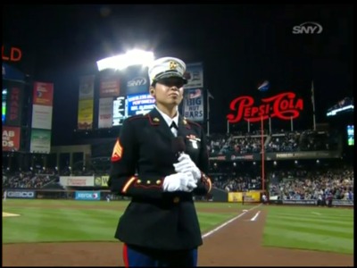
Here’s Sgt. Elizabeth Quinones who sang God Bless America in the 7th

3 Replies to “Two more screen grabs of the Mets stars and stripes cap”

  1. Like I said on the FB page in the comments. I don’t like these hats. My personal opinion. I would prefer them to come out with the Mets hats with a flag patch on them. Heck I even prefer the White Stars and Stripes ones from a few years ago. This style of hat just doesn’t look good regardless of whether the logo is has the stars and stripes design on it. So if you guys don’t agree with me feel free to post in the comments directed to me and not Shannon. I know we all can’t agree on everything.
    Also,If I have offended anyone by calling these hats ugly I am sorry. But I stand by my opinion.

Comments are closed.