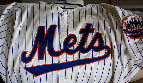
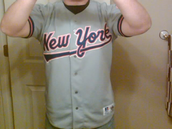
These have grown on me over the years. At the time I HATED them (Osh41 fired me up) and found them completely unnecessary. Now they are sort of like Mercury Mets jerseys: fun to dig out, but the Mets shouldn’t wear them. I like the road one a little better than the home.
What’s scary is we thought there could be nothing worse. If only we knew. Be careful what you wish for.


The swoosh could have possibly worked had they not changed the letters to a more amateurish look at the same time, especially the M. According to the 1993 Yearbook, they also went to a different blue…”one Pantone color darker.” The road look is the second best road jersey they have had, behind the original/current one.
The home jersey shown above is missing the white outline on the lettering, no?
I remember commenting at the time that the Mets has basically copied the template that the Expos used when the changed their uni’s dramatically the year before. the lettering, the tail etc. were very similiar. and yes the Mets jerseys had the white dropshadow – pic above is a replica.
Nice…osh41, which browser are you using? How did you insert those photos?