A hybrid hybrid Mets cap

Terence found this at a Sports Authority in Yonkersmets hybrid hybrid cap

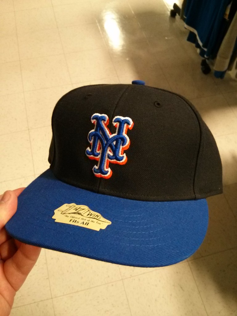
Now you might be asking – so? What’s the big deal? Look at that cap again.

It has white outline around the NY.  Although the black caps had white outline (presumably so the phone didn’t ring from the 415 area code) the old hybrid caps did not.

My biggest complaint with the hybrids was that the NY didn’t pop.  Had Jeff Wilpon rolled these out maybe we’d have a whole different narrative on the blog.  Don’t get me wrong, black Mets uniforms are awful, but maybe these caps might have been less offensive.  ANyway, nobody show this to Jeff.  Between this and the swoosh jerseys I’m getting nervous.

8 Replies to “A hybrid hybrid Mets cap”

  1. These have been around for years. I believe one may have even been mistakenly worn in a game, or possibly by a pitcher warming up in the bullpen during a game.

    1. Yes, somebody did wear that in a game once. I don’t remember who, but IIRC, it was an outfielder off of the bench. I had a screencap of it on my previous computer. It was mentioned here, and there was even a blurb on Uni Watch. I’ll look it up when I have a chance, but with the day I have ahead of me, somebody’ll probably beat me to it.

  2. I’ve seen them before and they DO look nice with the black jerseys. While I’ll never understand why the color black was incorporated into our gear, the one good thing about it is you don’t have to wash them as often. And, in general, they need to fix the blue, by the way. It should be an exact match to the Dodgers’ blue as that’s where our blue comes from (and orange from the Giants). It’s too much of a royal blue, completely different than LA’s color. Just saying. 🙂

    1. You’re right about the mismatching blue. On the flip side it’s always bugged me that LA kept Brooklyn’s whole look except they extended the tail under the wordmark all the way to the ‘D’ (it stopped short in Brooklyn) and they didn’t keep the old school font for ‘LA’
      on the caps and switched to that block serif style for some reason.

  3. The Mets blue is the original Dodger Blue when they played in Brooklyn. The Blue the Dodgers use now is different and darker. Also, any combo of Black and Blue on Mets gear is awful.

Comments are closed.