The quite uninspired Mets Frank Cashen patch

Look, I really don’t want this blog to be all bitching all the time. I would love to write about playoff games and the cool fan experience and how sharply the Mets are dressed. I really do.

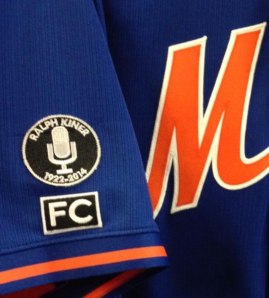
However, my opinions are my opinions and I think this is quite uninspired. I’m happy the Mets are honoring Frank (even if it took a few days whereas other teams seem to be able to react quickly, see Tony Gwynn’s passing as a recent example).

Anyway, image via @Mets and it looks kinda “STFU Fans”. I think a plain black armband may have been better. What do you think?

20140704-141307.jpg

4 Replies to “The quite uninspired Mets Frank Cashen patch”

  1. Points for doing something, I guess. I probably would have liked the patch if they put Frank Cashen’s initials in a black bow-tie shape instead of the plain black rectangle.

  2. You give the Mets way too much credit.  they don’t know how to run any aspect of a franchise, so why should they have magical powers to design a patch? If another baseball executive who wore a bow tie passed away recently they could have copied it…I hope you realize the Gary Carter patch was exactly copied from Detroit’s Sparky Anderson patch. When you have a kid who is a below average student, you praise them if they do the basic work…that’s what the Mets did with this patch. You can’t expect more.

  3. @Dept of Corrections  If other teams hadn’t done patches to commemorate the passing of announcers in recent years, I’m sure Ralph Kiner’s patch would have been as uninspired as the one they did for Bob Murphy, which was just his name embroidered over the top of the Mets patch. Or the patch they wore for ONE game to commemorate the passing of Tommie Agee in ’01.

  4. Michael_E_Timms  Exactly…I remember the Agee patch…it had 20/60…60 for prospect Brian Cole who died tragically.

Comments are closed.