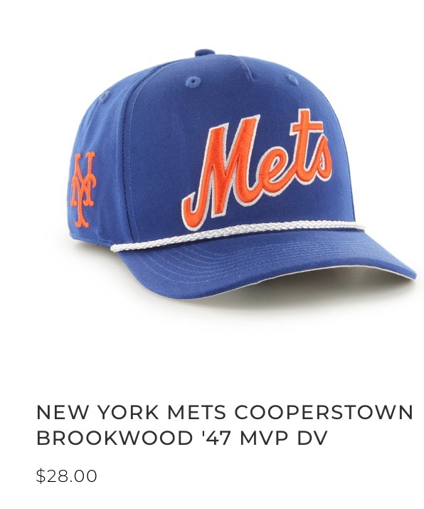
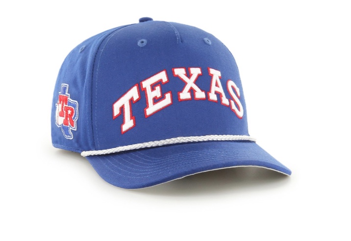
I feel like they are making tons of caps this summer. most of them awful.
One trend seems to be putting a word mark on the cap instead of the logo. Unfortunately for us Mets fans, the word Mets does not stretch out well, and the blue and orange doesn’t work on this type of design. Compare it to the Texas cap I included which works much better.