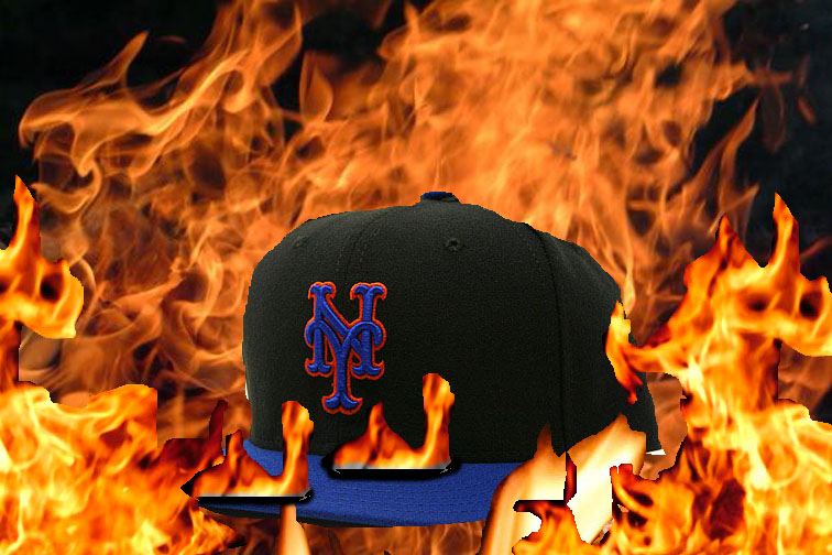
What we got, the cluttered look (here seen being set on fire) where the blue and black all make the thing look purple. The NY doesn’t pop at all.
What they could have done was add a little white and…now the NY pops.
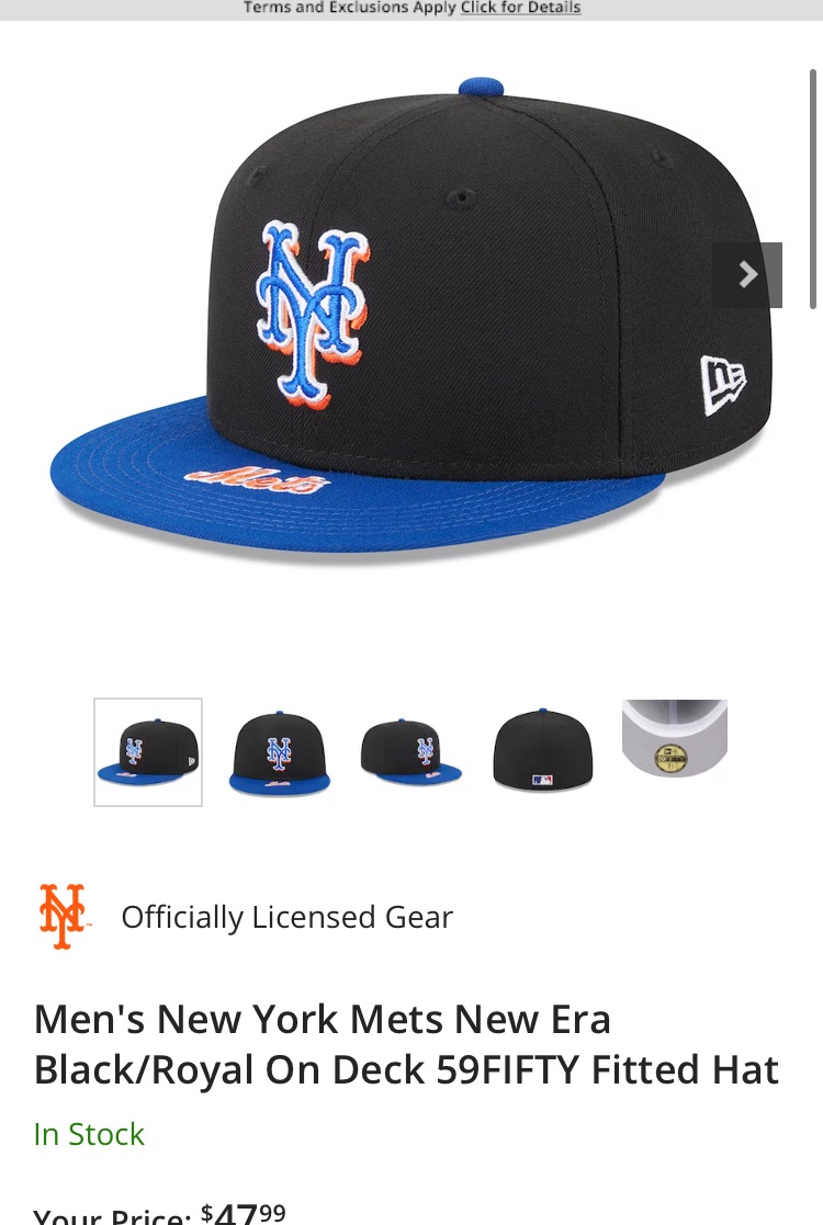
That said, the only caps the Mets should wear is the traditional one.