New York Mets “At ’em” jersey

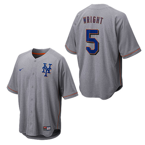
MLB (across the board) and Nike have a new line of “At ’em” jerseys, (the gray one) what does everyone think of the look?  It reminds me of one of the proposed jerseys from last year’s uniform survey.

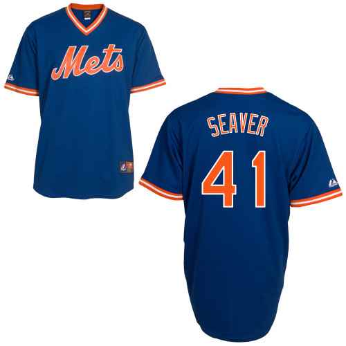
I may have to treat myself to one of these blue ones (those are not At ‘Em, I got distracted) and party like it’s 1983, that’s right in my wheelhouse, although I’m not sure why the Ryan one exists.

8 Replies to “New York Mets “At ’em” jersey”

  1. I got excited when I saw the blue jersey and thought the Mets were going back to the blue as an alternate!

    That grey one is pretty ugly. Hope to never see anything resembling it on the field.

    Wish I knew the blues were 20% off, would have bought a Strawberry.

  2. The blue isn’t quite a 1983 replica. The old blue road alts used grey bordered by orange in their script. Of course I prefer the orange used here.

Comments are closed.