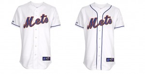
Michael sent this over – this is what the rumored pipingless 2011 pinless could look like if the blue piping is removed.
Nice job by Michael on this photoshop.
As some others have pointed out, it looks kinda like the late 70’s pullover road jerseys. Â I think I prefer it with the piping.
For clarity, the Mets have not announced any jersey design changes.
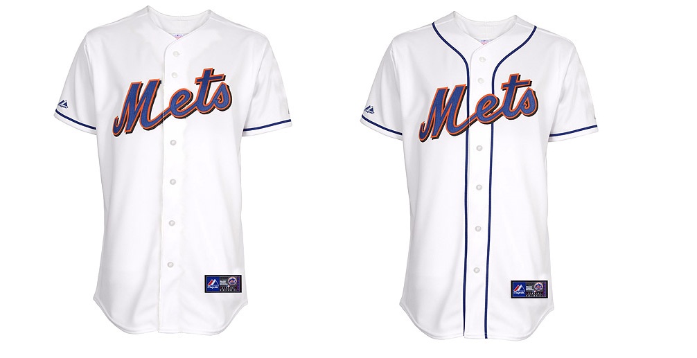
You still got some piping on there, and to really get the look of the first pullovers you need the think striped cuffs.
White, pin-free jersey, without a hint of piping…hmmmm…what comes to mind…
http://www.sportslogos.net/images/logos/54/63/full/m2h92a1ke8bgrceojp7jyn5sp.gif
Shannon. I agree with FormerDirtDart. The piping was left on the sleeve in that picture. That would look silly. I think it would look more like your prior mock-up (blue-orange-blue) on the sleeve bottom. I personally like it, but it would need to be off white in color ala the SF Giants and NO BLACK BACKDOP! You are correct though when you say it has a 70’s pull over feel.
i only like it if it has the blue/orange/blue striping like yesterday’s mock up. this (which in my understanding IS what the 2011 version would look like) looks silly and like a cheap replica. if they’re going to get rid of something on this jersey, we all know what it should be: it rhymes with crack moptarrow.
The idea of no piping on the chest is actually growing on me, but if they don’t add something elsewhere, it’s going to be too plain. “Cheap replica” is pretty good description.
Last year’s “NY” throwbacks would make a good template, with the stripes around the sleeves and collar, but that’d almost be a 100% knock-off of the Phillies alts.
*is A pretty good description