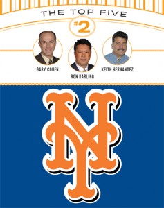
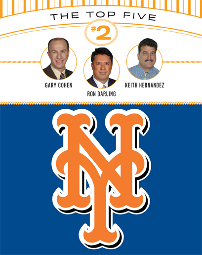
Sparks sent this in a few weeks back:
 I’m sure you saw this story, but I couldn’t help from focusing on the logo they put on there. I’d never seen this orange-with-a-white-outline-and-black-shadow-on-blue setup before. Is this new, or has it been out there and I just missed it to this point?
While the black is still completely unnecessary (obviously 😉 ), I could live with this as a form of its inclusion on BP attire, printed items, etc.
Sparks, I hate it. Â The white outline annoys me, and then there’s black dropshadow on it….it’s too much. Â No need.
