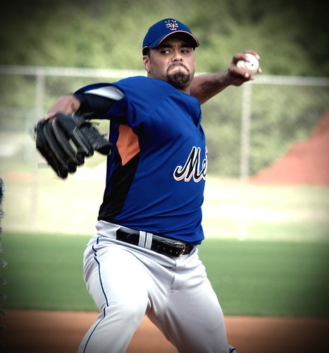
 I’m kinda fried this morning, but have a few neat items to develop, just not yet. Â As the coffee kicks in let’s ponder this jersey Santana is wearing (photo from MetsBlog.)
As regular readers know, I wish the Mets would wear traditional colors and get rid of the scourge that are black Mets uniforms. Â However, I will not be a complete Nazi, and if on a spring training day they insist on wearing orange, green or even black letters on blue (like in the photo) I will deal with it. Â I even thing the black NY on blue looks way better than the blue NY on a black cap.
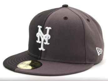
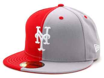
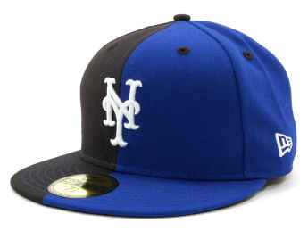
I know the idea is to sell more merchandise (remember everyone, this is a business) but even if you wanted to buy one of these, wouldn’t you prefer it without the extra layers of visual noise?
However, why does MLB/Mets/Uniform Maker have to go the extra mile and add the ugly orange underarm? Â What does that add? Â What does the black stripe add other than it makes Santana look fat in this photo?
I need to find some time this weekend to watch the Olympics Ceremonies, today’s events, some Nascar races, and the three episodes of Mets Yearbook that I haven’t watched yet. Â With Valentine’s Day in the middle. Â Seems challenging. Â Off to have some coffee.
If you’d like to join the free fan-meetup on Opening Day we’ll be happy to see you.
 Cool stuff
  I see a bit of a discussion about a proposed Mascot race at Citi.
 Dan Matlack and I became Facebook friends after I mentioned Jon Matlack a while back, and Dan has started a