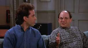
INT. JERRY’S APARTMENT – DAY
Steve enters Jerry’s apartment with an air of excitement.
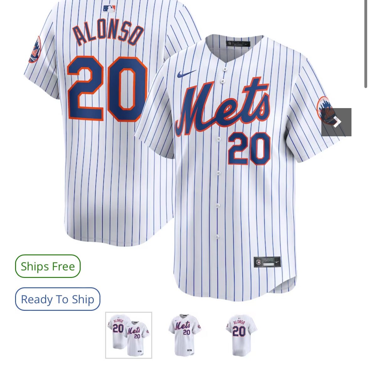
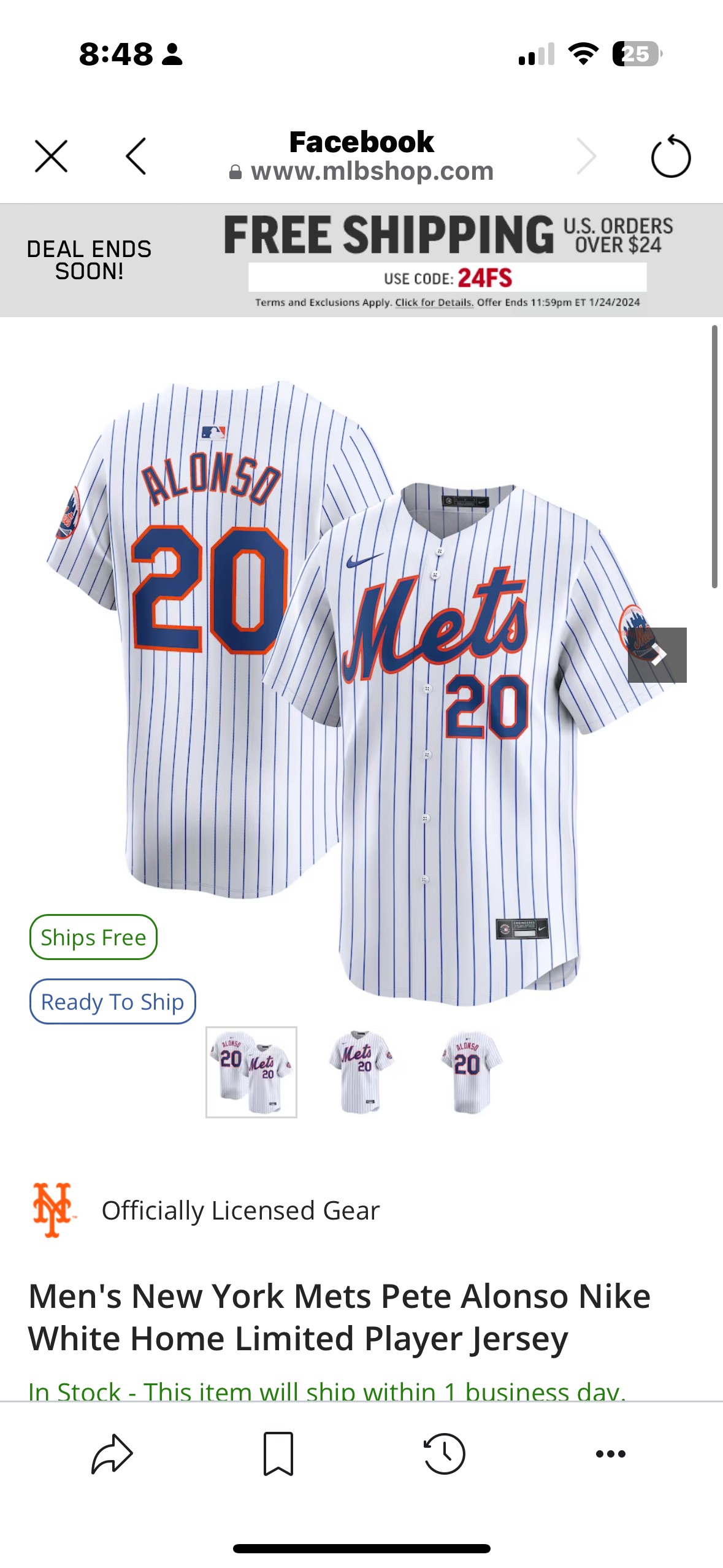
STEVE: (excitedly) Jerry, big news! The Mets have new uniforms!
JERRY: (interested but confused ) New uniforms? Why?
GEORGE: Jerry, what’s the opposite of black?
JERRY: (matter-of-factly) White! You’re bringing back the pinless? I did kinda like those.
STEVE: (shaking his head) No, Jerry, I’m getting rid of white.
JERRY: Getting rid of white?
STEVE: Getting rid of white. The new black jerseys will have no white.
JERRY: (confused) No white?
STEVE: (proudly) No white, Jerry. Fans want an even blacker jersey. A jersey so black, that is has no white.
JERRY: (skeptical) An all-black jersey? That’s going to look like a walking shadow.
STEVE: (enthusiastically) It’s bold, Jerry. Bold and different! It’s the jerseys the fans want.
JERRY: (sarcastically) What they wanted was a jersey that says ‘Ohtani’ on the back, not ‘Ninja.’
INT. JERRY’S APARTMENT – CONTINUOUS
While the conversation about the new Mets uniforms continues, Elaine walks in and overhears the tail end of the discussion.
ELAINE: (curiously) Whatever happened with Ohtani anyway?
STEVE: (matter-of-factly) He didn’t call..
ELAINE: (surprised) He didn’t call?
STEVE: (annoyed) Yes, Elaine. He didn’t call.
ELAINE: well, did you call him?
STEVE: Elaine, Uncle Steve doesn’t make the calls. People call Uncle Steve.
JERRY: (chuckling) At this rate, people are gonna call Uncle Steve a lot of things this summer, and I don’t think ‘genius’ will be one of them.
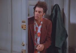
As Steve is explaining the new all-black Mets uniforms, Kramer slides into the apartment.
JERRY: (to Kramer) Kramer, get a load of this. Steve’s got the Mets in all-black uniforms. No white.
KRAMER: (puzzled) No white?
STEVE: No white.
KRAMER: No white? But the jerseys won’t pop!
STEVE: (confused) Pop?
KRAMER: (animatedly) Yeah, pop.! You know, that visual zing! Bam! It catches your eye, makes the players stand out! No pop.
JERRY: No pop.
ELAINE: No pop.
STEVE: (considering) I thought it was about being sleek, modern…
JERRY: (chuckling) What, are they going to play in the dark? They’ll look like a bunch of shadows running around the field.
KRAMER: (nodding) Exactly, Jerry. You need contrast. The white pops against the black. It’s visual dynamics!
STEVE: (sighing) I thought I was on to something revolutionary…
JERRY: (teasingly) Yeah, a revolution in disappearing on the field.
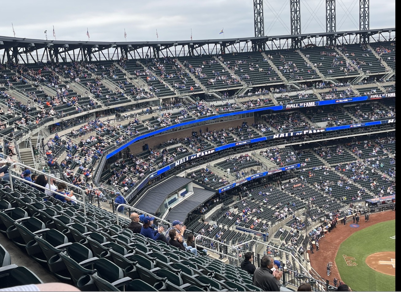
INT. CITI FIELD – GAME DAY
Jerry, Elaine, Kramer, and Steve are sitting in the owner’s box at Citi Field, watching the Mets play in their new all-black uniforms. The sparse crowd’s reaction is a mixture of confusion and amusement.
JERRY: (observing) Look at this, the players are practically invisible out there.
ELAINE: (squinting) Which one’s the pitcher and which one’s the umpire?
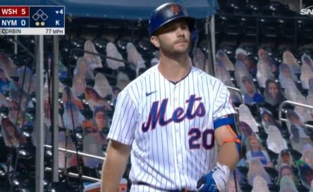
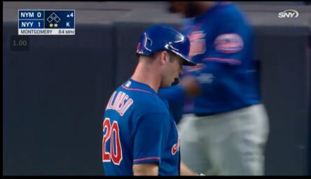
The scoreboard shows a close-up of the players, but their jersey numbers and names are nearly indistinguishable.
KRAMER: (frustrated) I can’t tell who’s who!
STEVE: (defensively) They looked good in the drawings!
ELAINE: (joking) Maybe they can sneak up on the other team.
STEVE: (sighing) This seemed like such a good idea at the time.
JERRY: (quipping) Well, Steve, at least your team is leading the league in one category: stealth.

