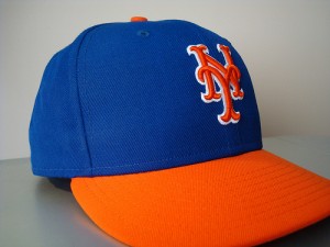
11 Replies to “The alternate alternate Mets caps”

  1. I don’t mind an alternate cap… but I wish they would just wear the blue cap on the road as well. I just bought a road gray jersey and it looks great with the all blue cap.

  2. I’m increasingly of the opinion that the black has no place as a ‘third color’ in the Mets uniform. I’d like to see them go back to the 1960s unis and stay there. I realize it’s not the perfect uniform, but it’s the only uniform in the world which people associate with the Mets. One cap, two unis, end of story.

    If an alternate must be had, then really why not make it pink and green for all I care.

  3. I have revisted my opinion. I think the Mets should not get involved in alternate hats with alternate colors. However, I think there is an alternate cap that they should wear.

    The Mets are their own team, we all know that, but their uniform was based on all three teams, but primarily the Giants and the Dodgers, as we all know. They borrowed a color from each team, but only the logo from one.

    As a Brooklyn boy, growing up, the D train to the Yankees was actually closer than taking subways to Manhattan and then catching the 7. The Brooklyn fans deserve their hometown team. For them, the B on the cap would be a very good thing.

    Had the Brooklyn Dodgers accepted Robert Moses’ proposal that they move to Flushing, we would have had the Brooklyn Dodgers in Flushing anyway, probably wearing a B. There is precedent, such as the NY Giants and Jets in Jersey.

    If there is any issue with copyright on the B, then the new B designed by a fan for the Cyclones would be appropriate, and perhaps even preferable.

    This would be a meaningful, and deserved, alternate hat. Brooklyn Dodgers colors and logo were not imo adequately represented in the Mets design. I think the Mets make more sense to me, when seen as the hybrid Giants-Dodgers, morphed back into the Metropolitan baseball club, which was the original club back in the 19th century which gave players to the Giants and Dodgers when it dissolved.

    There is history here, and I think the Mets should get into it. If seen as a piece of the NY NL puzzle, they are more interesting to me.

    So my vote: blue with orange B logo.

  4. This Fitted sure beats the current Hybrid Black and Blue Fitted by a LONGSHOT!!! And in regards to the previous argument for a Blue Mets Fitted with an Orange “B” logo???…NO! Chill! Please don’t give the Wilpons any ideas!…Look! I’m from Brooklyn also…PROUD as HELL!!! But the Mets are the METS!…They already honor BKLYN by using their colors. Let’s keep it as original possible. The only thing that the Mets have to do in regards to the Blue Fitted is just go back to the original shade of Blue and of course get rid of the BLACK completely. Right Shannon?

    1. You forgot about the button on top. They’ll have to return to the blue button on the all-blue caps before there can be lasting uniform peace.

    2. Yes, but the Mets honor the Giants with their logo as well as one of their colors.

      Let me put it this way. Growing up in the pre Internet age, I had no idea about the Brooklyn Dodgers, but because of the logo, the Mets seemed the second incarnation of the Giants.

    3. I agree about going back to the original shade of blue, but I disagree with the other poster about the blue button on top. This is yet one further connection to the Giants and Dodgers that I value.

Comments are closed.