Mets jerseys with Osh41 (part 4)

Another in a series of looks at uniforms of the past with Osh41.  Take it away…

The year was 1978 and the Mets were entering the first season of the ‘post Seaver’ era.  So what did the Mets do?  That’s right they changed their uniforms!!  Welcome to another uniform discussion with osh41.

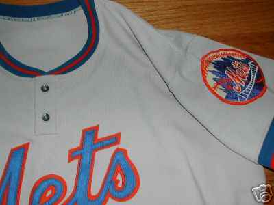
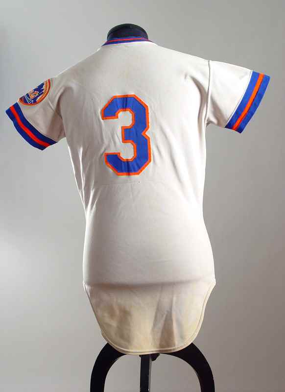
The 1978 -82 home and road 1978 -81uniforms were a drastic departure from Mets uniforms from 1962-1977.  Gone were the button up jerseys – they were replaced by a pullover style for home and road with two buttons at the top.  The sleeve edges and collars were graced by a blue/orange/blue border.  Hey it could have been worse – at least they kept wearing belts and not the awful snap pants like many other clubs of the era.

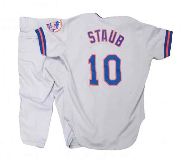
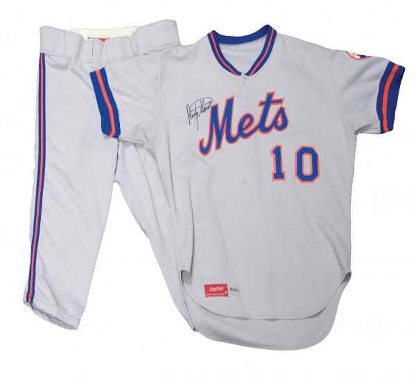
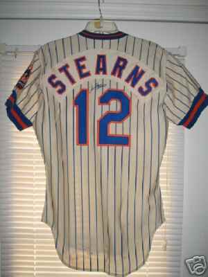
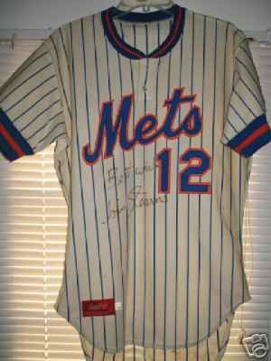
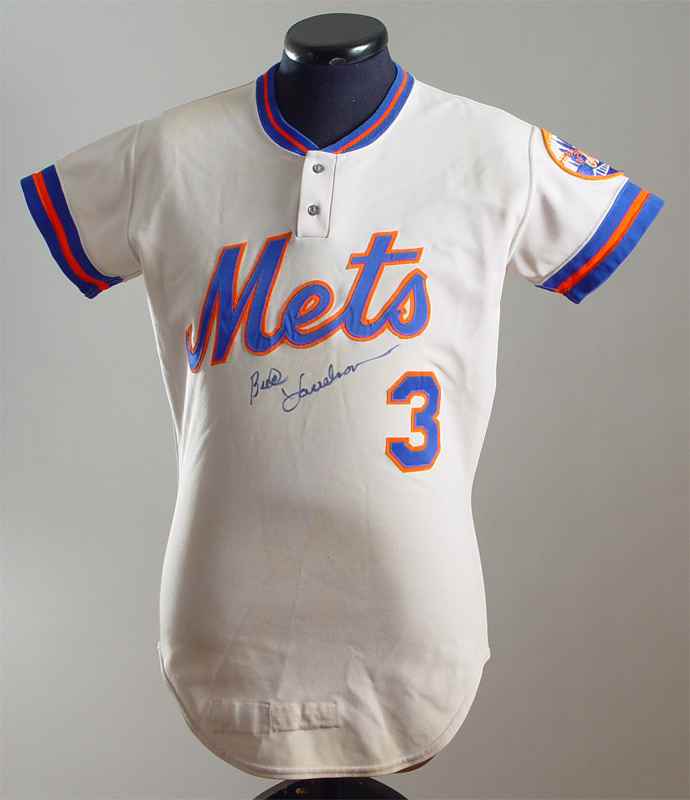
In 1979 the Mets introduced (much to my dismay) – names to the backs of both road and home uniforms.  The names were stitched to a nameplate and then stitched to the uniform backs – which looked kind of awkward on the home pinstripes.

The rest of the MetsPolice and I are big advocates of the no name on back style – at least at home – if you don’t know your team by uniform number alone you should rethink your fandom.  And hey Fred and Jeff – make people buy scorecards!

For fans of MetsPolice and my generation these uniforms represent absolute futility – arguably the worst era in Mets history – trust me on one you fans born post 1986.  The early Mets of the 60’s were at least lovable – they were an expansion team after all – they were expected to be bad.  This uniform experienced no glory at all – just punch lines.

6 Replies to “Mets jerseys with Osh41 (part 4)”

  1. I like the names on the backs, especially with the way rosters are nowadays.

    And most fans aren’t quite diehard enough to memorize them all.

    Do you remember which number Stokes wore last year? Ken Takahashi? Cory Sullivan?

    1. Ceetar I don’t, because i don’t care about those players. I’m sure if you asked me mid-season who they were I would have known, but being honest I cannot pass your quiz today.

      If you are watching on TV the chiron tells you who the player is. On the radio Howie does. From the Promenade the tiny letters won’t help you so whats the point?

  2. Actually, I’ve never had a problem making out most of the names from the Upper deck or the Promenade. So that’s where it’s always helped me identify the backup IF or the reliever. Especially where I’m not as able to make out discerning features as much.

    Even at the stadium though they do do a pretty good job of things like “warming up in the bullpen, #34..” but I like to try to spot what’s going on long before that, or spot guys in batting practice or in the dugout, and it’s harder without names.

    These days I think the whole 2-uniform no-name thing teams like the Yankees stick to is more egotistical than historic. And it speaks a little to the general attitude many Yankees fans have of knowing next to nothing about the team and not caring.

    “Wow, they’re doing so great! That pitcher is mowing them down.!”

    “Who is it?”

    “number 42, I dunno, some guy. He seems good, did we just get him?”

    “I heard Francesa say we just brought up a rookie from Scranton! Maybe this is him? This guy’s good! go Yanks!”

    that may be an exageration, but I find the more things that inform the average fan at the game the better. (How about we compromise and put a small legend somewhere that has the 25 man roster and then leave the names off?)

    1. Ceetar has better eyes than I. If you’d like, you can sit at my side at the Treaty of Flushing and I will add names on the back to my list of concessions, in exchange for no more black.

  3. I also like the names on the back of the jerseys. I never really understood the objection to it, but I don’t really remember the days when it was common to see nameless jerseys on major leaguers.

  4. Great stuff … I agree with so much of what you’re saying. I liked the “creme” uniforms today, but they would look so much better without that awful black shadow behind the letters.

    If the “Mets” had a nice bright even orange outline the blue would come out beautifully. The awful “3d” Mets style with black always makes the whole thing look purple.

    Even worse is the “3d” effect on the names on the back. More purple. I would get rid of the names and ALL black anywhere.

    Black is not a Mets color.

Comments are closed.