As I mentioned earlier, it’s Saturday when I like to sleep in, eat donuts and spend some family time. Â I’ve also taken to making Saturday a less-serious day around here. Â So with that, I’m heading to Dunkin’ and here’s Walt:
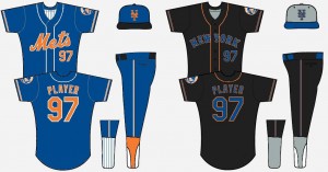
I decided to basically throw all of the Mets uniform colors into a blender, and see what comes out. Both Home & Road uniforms retain a small touch of traditional coloring for flavor (and whimsy). Piping on both uniforms is is coordinated with the color-way of each jerseys word-marks/lettering/numbers.
My Home uniform is more based off of the Mets primary “ball and city-scape” logo than the traditional & current home uni-sets.
The Road uniform retains the traditional “NEW YORK” word-mark, while going with a seriously old school dark road-uni look.
Of course, this will probably cause a number of Mets fans heads to explode.


Kinda thing the black road jersey is a bit of an improvement on what they have right now. As for the rest, ah, not so much.
Oh, and I am referring to the black alt jersey. I still prefer the traditional grey jersey and believe it to be one of the best and most classic uniforms in all of MLB.
Yeah, this was simply an exercise in pure whimsy. I never meant it to be anything else. After sending it to Shannon I thought maybe I should have gone with a 3/4 placket, to completely embrace the early 1900’s feel
I’m digging the grey road cap.