I was reading the latest Entertainment Weekly (waiting for the inevitable picture of Tina Fey, must she be in every single issue ever?) and stumbled across an article called Color Scheming:
“Orange and Blue are complimentary colors, so just by nature they give you that jolt that you need,’ says veteran movie adman Charles Riemers…
 The article shows some blue and orange posters for The Bourne Identity, Transformers, Iron Man 2 and others.
So that got me thinking.
Say I owned a baseball team and I wanted to market it. Â Maybe it is the 50th season of my franchise playing baseball and I want to really pull out all the stops for 2011.
Maybe a nice marketing campaign with this powerful color combination. Â I could see some subway ads with say David Wright,Jose Reyes, Ike Davis, Johan Santana and Mike Pelfrey…or Seaver, Hernandez and Piazza…..all with a nice blue and orange color scheme. Â (You photoshop guys, start working out some concepts for me to present to Dave).
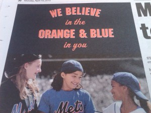
What’s great is that this campaign would echo and build upon 2010’s “We believe in Orange and Blue.” Â It is consistent and on-brand. Â We do believe in Orange and Blue don’t we?
Then there’s a desire to sell product. Â Say, new jerseys.
A 50th season would give me a great reason to add a patch to your sleeve.
Maybe a nice white jersey with the traditional blue and orange lettering, with NO BLACK DROPSHADOW….Jeff, that was NO BLACK DROPSHADOW would sell.
They got it right the first time. Â 1962-2011 is the perfect excuse to go back.

Help me Howie Rose, you’re our only hope.