Of course 70’s week will deal with uniforms. Â Here’s our Uni Expert Osh41:
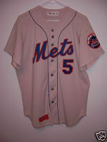
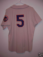
This is a circa 72-73 Mets road jersey – Shannon and I dreamed of the day the Mets would reintroduce these jerseys, we would watch 1973 World Series films during rain delays and call each other to discuss how cool the road jerseys looked and hoped they’d make a return.
The Mets introduced polyester jerseys in 72 and got rid of the classic ‘New York‘ lettering beginning in 1974 so this specific jersey existed for only 2 years.
Mets road jerseys did not display ‘New York’ from 1974 through 1986. In 1987 New York returned to the road uni’s in the form of the script New York (we’ll talk about them in future posts)
In 1974 the Mets removed the ‘New York‘ from the front of the road jersey. What they went with looks very much like the ‘snow whites‘ that are part of the home jersey rotation now (minus the black – of course).
Why the Mets removed the ‘New York’ from the road fronts is a mystery, they looked awesome. At any rate this is a clean look, although not as cool or as classy as having New York spelled out. And guess what is doesn’t have on it?? That’s right – BLACK. Don’t get me started.
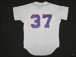
If you are a jersey aficionado, i.e a jersey dork like me, you’ll notice the number font style that was in place on road jerseys from 1962 – 1973 has changed. Â What was cool about Mets jerseys from 62-77Â was that the road and home jerseys had difference font styles for the numbers. Â Starting in 1978 with the intro of the pullover 2 button style – the subject of a future post – the numbers were consistent on both the home and road jerseys.


