In the comments Michael wrote:
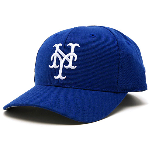
In the spirit of compromise, how about if the Mets wear blue caps like these
 Shannon: No way. We almost ran Fred out of town for honoring a great man. He’d get killed for the Dodgerness of this one even though it is in fact a 1936-39 GIANTS cap. Can’t do it.
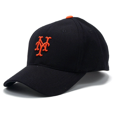
Michael: black caps like these
 Shannon: Well, yeah….if there must be black OF COURSE this is the way to do it. I even own and wear this cap sometimes. For you Piazza Generation’ers, this is a 1947-57 NY Giants cap.
It seems like Michael had some other good ideas but the links didn’t work for me (when I got around to this a week later)….he did like this uni combo….Michael, send me a guest post to [email protected] and just embed all the images.
Guests Posts welcome, it’s a long way til March: [email protected]
Have re-sent via email with pics embedded!
Oh, for what it’s worth, blue at home and black on the road.
Michael, I like both of those…Blue with pins at home (Mets uni’s, not Dodgers) & the black with the grays would look nice.
I’m partial to the Snow Whites, but the blue cap would go with either.
Okay…….how bout BLUE caps with ORANGE lettering !!!!!
I’ve been noticing the black hat looks good on gents and ladies, young and old around town. It represents the team colors well (black being a neutral background for the clashing blue and orange). I think they should carry the two traditional unis home and away w/o black, and then keep the black alt uni/hat. People dig it.
And when to wear the black? I say wear it whenever the Giants or Dodgers show up.
Greg thatsareally interesting idea!
The city’s never had a chance to vent the anger it must surely feel. And also, why don’t the Mets promote a rivalry with those teams? The Red Sox have nothing on the Dodgers and Giants as arch villains. I mean, what a bunch of hasty idiots, to leave NYC for California. Play it up, says I.
A tuxedo also looks great on civilians but looks bad at third base. Sell anything. Play baseball dressed nicely. Did anyone check out the new Indians roadies?
Black, at least with caps and jackets, looks great. It’s not as if the Mets looked great dressed in jerseys like this (http://nbcsportsmedia2.msnbc.com/j/msnbc/Components/Photos/040108/040108_mo_vaughn_.widec.jpg ) or this (http://www.astrosdaily.com/history/1986NLCS/1986g3a.jpg), both of which were blue and orange.
I agree. Having one color for a shirt and another for the pants is tandemonium.
If the Mets wanted to get their basic gear more palateable on the eye, they could make some pretty easy moves. Notice their PR uses a darker blue with a subtler orange? And they used to wear darker blue? Darker blue. They look almost like renaissance clowns with bright blue and orange. Remember in their rookie season there were no numbers on the front? Get the numbers off the front. Gradually peel off the layers of paint and vertigo from this uniform. Yankee pinstripes? Mets fans say those aren’t Yankee pins, but … they most certainly were intended to be Yankee pins. Off with the pins.
They struck gold with the cream color. It buries the orange really well, and actually looks classy, to me at least. They’ve got two of the greatest logos in sports, the NY, and the round skyscape baseball.
Blue and orange are an exciting contrast, but it needs to be managed by someone who understands the color wheel.
Actually, I think you’re on to something here. I am a fan of the black (which has been an official color of theirs for 1/4 of their existence), but still think the Mets need to go back to their roots and Dodger blue.