The mystery of the returning NY on the Mets ball logo

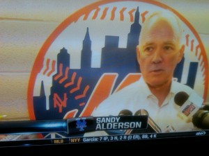
Mrh caught a glimpse of this and emailed it in.  Supreme Commander Lukas also shared an ESPN video with the same thing (the video seems to be gone now.) Notice anything?

The NY is back on the ball logo.   Since 1999 when all sorts of other bad things happened, the logo has looked like this.

Fascinating.

I wonder what it means?

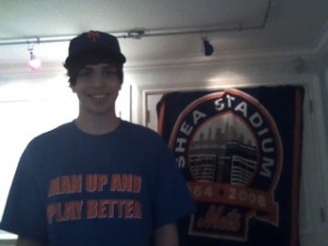
Mac got his Man Up and Play Better t-shirt.  You can easily get one for yourself by choosing your size then clicking the Buy Now button.  As captialists we make like $5 a shirt which funds all this.

I know…that’s a pretty hot looking shirt, right?
Well, if you’d like one you can now have one just by using this snazzy Paypal button. (Dara not included.)


Choose Sizes S, M, L, XL, 2XL

The Yankees are having something called Old Timers’ Day today.  Gooden and Strawberry will be there.  (So will Lee Mazzilli and Cone).  Sigh.

8 Replies to “The mystery of the returning NY on the Mets ball logo”

  1. There is another oddity in that logo…Here is the true, original logo:

    http://www.realclearsports.com/blognetwork/inside_mr_mets_head/mets1962.jpg

    Notice that the blue on the left of the first building is way too high on the logo behind Sandy. I have never seen this error before. You may also notice on the right of the second building (Brooklyn’s Williamsburgh Bank) the blue is much higher than the original…this error has been around for awhile.

  2. At the College World Series in Omaha!…Saw a few Met Caps here…Actually saw a Met Cap also at “Field of Dreams” in Iowa! I hit a blast into the cornfields!….Maybe Shoeless Joe Jackson caught it!

    GO GATORS!!!….LETS GO METS!!! .500 Today!

  3. It means that they kept a couple old wall hanging logos from Shea and brought them over to Citi! I don’t get why people are so up in arms about it being removed a dozen years ago and wanting it back now. To be honest, that little NY looked like crap! It looke like the “NY’s” on the “Bang The Drum Slowly” jerseys and was put on there by an Arthritic Senior.

    Fight the better fight first: Blue Caps on the road!!!!

    TMK

    1. I thought the little NY was cool…it was put there for a reason by the artist. I’d love to know what genius was qualified to remove it. Was it to try to market the Mets outside of just NY? Or was it done because it was hard to do on the black version? Either reason sucks.

  4. They took it off because it looked like it was made with matchsticks and the size of it made it too impractical to fix. It looks fine on things like that giant decal behind Alderson, but shrink it down to a sleeve patch or letterhead or whatnot and it’s ugly at best and just an orange smudge at worst.

    Originally, the NY DID match the cap logo (somewhat anyway) and had curls on the ends of the letters, as seen here:

    http://216.77.188.54/coDataImages/p/Groups/416/416886/folders/306109/2471901originalskylinelogo.jpg

    In time, that tiny detail fell by the wayside in practical use and it was simplified to the stick figure.

    The disappearance of the NY actually began with a desire to dress it up again, which eventually resulted in the designers saying, “Ah, screw it. This isn’t gonna work:”

    http://216.77.188.54/coDataImages/p/Groups/416/416886/folders/306109/2471901originalskylinelogo.jpg

    I like the NY myself, but it does have a point of diminishing returns depending on the usage. If it’s on a wall, scoreboard, or full-page graphic, sure, do it up right, serifs and all. Otherwise, don’t bother. The sleeve patches look better without it.

  5. I think, on some level, the imperfection of that little NY symbolizes the imperfection of the early loveable Mets. Not everything has to be perfect. The NY was fine for 35 years. Personally, I do not buy any item prominently featuring that logo if it does not have the NY…then again I have a lot of vintage stuff with it already.

Comments are closed.