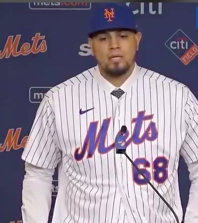
That looks horrific. As I pointed out before, the blue doesn’t seem to match, the angle of the swoosh is different than the angle of the M, and whereas the number used to give a visual counter-weight to the tilt of METS, I now feel like the whole thing might tip over to screen-side left.
Just terrible.
I know this genie is never going back in the bottle and in 10 years when there’s a big CAR INSURANCE PATCH on the sleeve we will yearn for the days when uniforms had “only” a swoosh…..but yuck.
Also, Mets/Kevin Kierst/Players – can we get back to wearing BASEBALL NUMBERS? Please stop issuing anything over say 40 except for a pitcher, and nothing over 49 unless the person is a coach.