A reminder to all brands not to use simian-based imagery in your Mets themed products this year. Don’t act like you don’t know about this because I called you out hard last year.
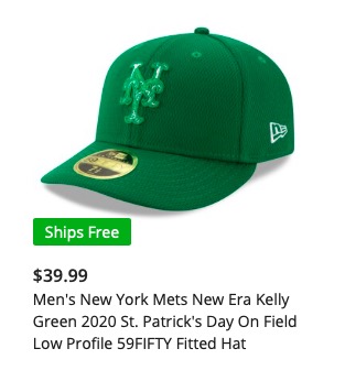
Fortunately, MLB has stared with basic green caps. They come in low crowns for normal humans (but YO $40???? SERIOUSLY??)
The cap also comes in in 20-foot-high crowns for Vanilla Ice and other people with bad taste in caps. But even with a crown that tall, it’s still better than incorporating stereotypes based in hatred.
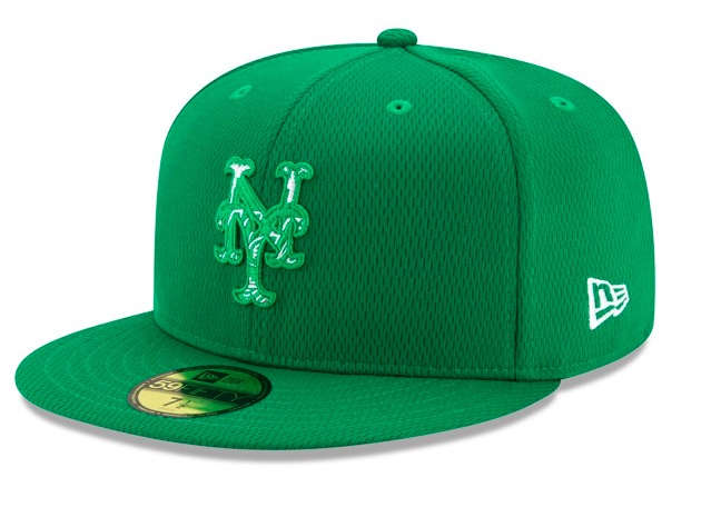
You may notice that the cap has the logo inside the logo thing like the BP/Spring caps have….but in all green that’s a total failure (I think Gen-Z wants me to say “total fail’…and the millennials probably just want a free cap but I digress.)
I also noticed this “86 Heritage Cap.”
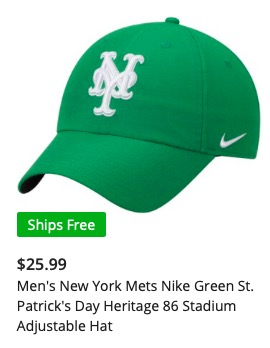
I’m not sure if the 86 is a coincidence or if it is a reference to something that happened to the Mets last century.
You may also notice that where the Cap Company logo often is, this one has a horrible swoosh.
I think these are all HARD PASS, but you’re supposedly boycotting anyway so I am sure none of you will buy one.