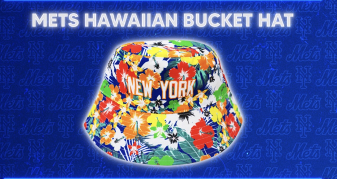
Yes I am familiar with the 1988 Road Jerseys, I own one, do you? You don’t need to lecture me. So look at the latest from Mets Marketing Chief, Poochie Cohen.

Why Poochie? Why?
WHO IS IN CHARGE OVER THERE?
That looks a hell of a lot more “Yankees” than it does anything Queens.
Other than that, there was potential in this hat. It’s too bad the Mets don’t have a distinctive font where you could have spelled out N E W Y O R K in a way that says METS.
These unforced errors are insane.
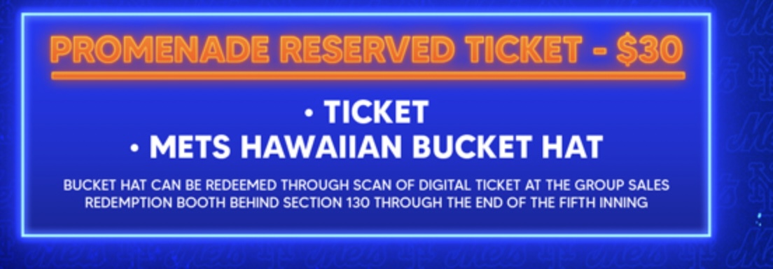
Aside from that – now is it worth it to drive to Queens, pay the tolls, parking and have to sit through a baseball game to get this for $30. Nope.

Anyway, Hawaiian night or Yankees night whatever it is – is August 8. I will be home.
