I thought I liked the orange caps…but they look terrible on field. And Carlos seems to have gone with high crown which is always a bad look. But lets look at the E…


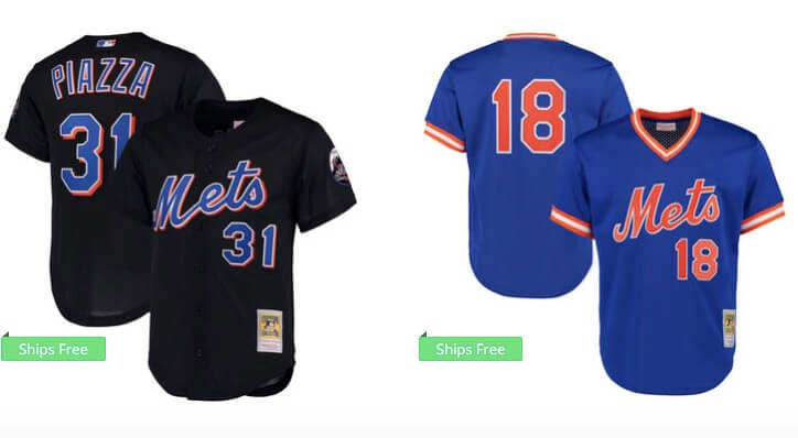
And if you are unfamiliar with the long tail M, look at the Piazza jersey below. The Mets fad cleaned that up, but looks like this template has messed things up.
I also don’t like the nee numbers, it makes everything look like a knockoff.
And why again is Carlos Mendoza the manager?

