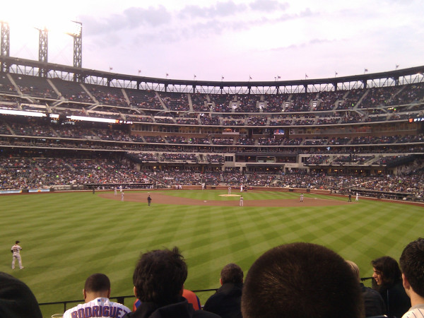
Thanks to @jerielzuniga who frequently hooks me up with crowd shots. This one from the first inning.
Mets crowd shot from Tuesday’s game vs. Giants
What Mets fans talk about when not talking about the actual games.
Thanks to @jerielzuniga who frequently hooks me up with crowd shots. This one from the first inning.
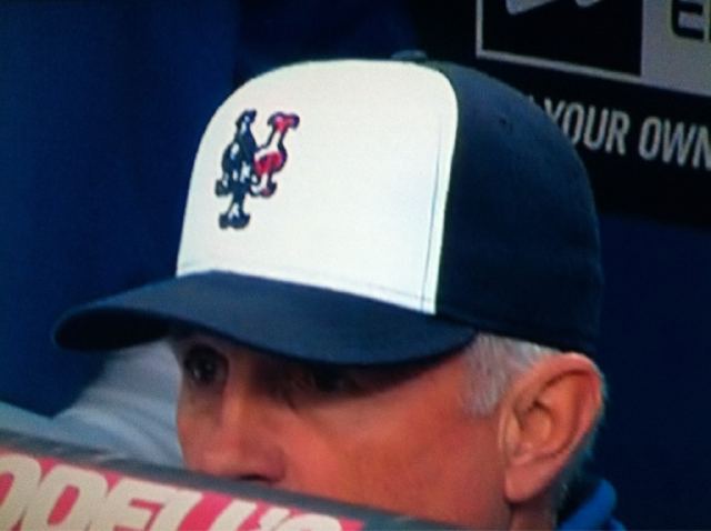
I know Shannon posted before about how he doesn’t know how he feels about the Mets wearing this style hat tonight. I won’t mention my views about which way I look at it. I just think this is an UGLY HAT!
I want to say that I don’t know how I feel about this, but the look on my face is giving it away.
The Mets are wearing stars and stripes caps tonight to I guess “support the troops” but something about the juxtaposition of the killing of Bin Laden and the timing of this doesn’t feel right to me.
I imagine the Mets’ hearts are in the right place, the Mets salute a service member at every home game I attend, the Wilpons have their initiative with Seaver, and this isn’t a “bust chops” or “complain about uniforms” post…but I dunno…something seems not warm and fuzzy about this one.
And et tu Jerry? Here’s the giveaway for Saturday night.

At least it’s not a hybrid…
Hi…straying big time into Uni Watch territory here but Steve did some research and came up with the following which may or not be accurate but I thought worth a discussion. LI Phil has been hanging around MP lately and Paul Lukas reads the site so perhaps they can educate us further or steer us to some links. Anyways, here’s Steve’s take on the subject.
I love precise detail, so I went back through every yearbook for the last 20 years or so…here is what I found:
1) The problems started, as you might expect, when the stupid, idiotic underline debuted in 1993. That made the existing wordmark obsolete and the skyline logo very inconsistent with the jersey.
2) Sanity prevailed 2 years later…in 1995, the underline was gone forever. The Mets were so proud that the jersey was restored, they decided to make the wordmark look slanted, like it does on the jersey, maybe as a subliminal message to get people to buy jerseys. That effort produced the dreaded Wilpon Script…it is clearly seen on the bottom of almost every page in the 1995 yearbook. It has nothing to do with making room for black dropshadows. It has been lurking for over 15 years already.
3) In 1998, the Mets decided to add the black…”Believe in Black” the yearbook says. (Shannon here – wow did they really do that? I got married that summer and wasn’t paying attention much. I also refused to give Cablevision an extra $10 (especially for Fran Healy) and mostly listened to Murph.)
4) In 1999, they decided that the skyline logo needed a midnight version and at that time they decided to drop the little NY…it was too hard to do on the midnight version I guess.
I believe the The Wilpon Script on jerseys does not seem to be too prominent until 2003, when it became very obvious.
Speaking of Uni Watch you should visit that site every day. It rocks and there’s almost always something about the Mets – today it’s a Lady Met doll.