I miss Howie Rose

I missed Howie last night.

The rhythm of the booth seemed off. And I have said before, Wayne sounds like about of town guy passing through rather than the voice of the Mets until 2040, and Eddie didn’t find his “I just came from McFadden’s vibe” at least in the part I heard.

Decided to go pillow over Mets.

I can’t believe some people are already freaking out about the second half. A scrap heap knuckler. Was bested by Lincecum. That’s gonna happen folks.

Enjoy your vacation Howie!

David Wright in a photoshopped blue Mets jersey

More email I couldn’t process while stuck on AT&T’s Edge network at nationwide airports.  Get it together guys.  Here’s Jeff:

Shannon,

Got bored & painted over this picture of Wright in alternate black.  He’s now in alternate blue.  After finishing, I couldn’t stand to look at the black helmet on the blue jersey, so I painted over that, too.  The helmet didn’t come out real well, but you already know what the mets cap is supposed to look like.

I’m a two-uniform guy, but this would make an ideal spring training uni, if MLB didn’t insist on Little League World Series-style generic jersey templates.

Cheers,
Jeff

As I was reading Jeff’s email, the Steinbrenner news broke so I told him that I’d hold off on the Wright stuff (until now apparently) and Jeff’s comments echo so many Mets fans:

Very sad. Ran his team like a fan. An erratic, wildly irrational fan. When he had the most day-to-day impact on his club, he managed to make the Mets the varsity team in NYC, something we’ll likely never see again. There’s no way myself and many other guys in their early 30s grow up to be Met fans had they not briefly ruled the NY baseball landscape in the mid 80s. That was as much the product of Steinbrenner’s madness as it was competent leadership in Queens.

A diminished, house-bound Steinbrenner was a greater tragedy than his passing. Although Met fans would say they hated him, we all know that if he owned our club, there’s no way a loser like Ollie Perez or irreparably tainted has-been like Luis Castillo would get anywhere near his starting lineup after their respective histories.
RIP,
Jeff

The Mets owners should pay attention to what Jeff said about Mets fans in their 30’s.   The Yankees have already stolen 15 years worth of kids.   Gotta win boys.  It might take money but you gotta win.

(I’m still catching up on emails – if I haven’t posted your submissions hang tough.  Thanks always for sending them in – shannon@metspolice.com)
Reyes was in lineup then scratched

Tonight, past my bedtime…..the west coast for me is like the Mets being on the dark side of the moon.

Angel Pagan – RF
Alex Cora – 2B
David Wright – 3B
Carlos Beltran – CF
Ike Davis – 1B
Jason Bay – LF
Josh Thole – C
Ruben Tejada – SS
R.A. Dickey – RHP

The last time Carlos Beltran batted cleanup was the last game he played (October 4, 2009 vs. Houston).

Tonight will be Angel Pagan’s 25th career start in rightfield. The last time Pagan started in right was May 29, 2009 vs. Florida.

The original lineup was

Jose Reyes – SS
Angel Pagan – RF
David Wright – 3B
Carlos Beltran – CF
Ike Davis – 1B
Jason Bay – LF
Josh Thole – C
Alex Cora – 2B
R.A. Dickey – RHP

Mets All Star 2013 jerseys likely to look bad (opinion)

If the Mets do get the 2013 All Star Game I’m a little worried about the All Star jerseys.

Maybe I’ll get my wish and the Mets will drop BLACK for the 50th season in 2011, but assuming they won’t because you know, black sells – it’s not winning, it’s black….

DIGRESSION TIME.  SOURCE: THE WASHINGTON POST July 12th:

According to MLB:

* More than 78,000 Strasburg jerseys were sold through July 1, making his the top-selling Nats jersey of all time. Yes, in one month he outpaced the entire career of Ryan Zimmerman for jersey sales.

Let’s see…the Nationals…what do they wear again?  It’s black isn’t it?  Yep, the Nationals sell lots of black Strasburg jerseys.

Anyways….I worry that the All Star Jersey could look clownfish if they have blue and orange and black.  You know how MLB loves to do that crappy underarm color nonsense (please stop.  please.)   We could have a real mess on our hands.

If I invent the holodeck in time and find myself in charge of the 2013 All Star game I will propose that the NATIONAL uniform be Mets WHITE and the AMERICAN wear blue.  No black.  No underarms.  I’ll actually suggest there not be All Star jerseys but I’ll lose that fight.

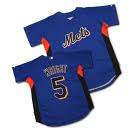
See this jersey below – imagine it with NATIONAL across the chest.  This is what I fear.

I also worry that Mets Font might look bad spelling out AMERICAN.  Then again maybe it won’t.

If you’re bored and good at photoshop get crackin’   Let’s see some 2013 All Star Game designs.

By the way, I’m looking forward to the Mets having home field advantage in the 2010 World Series.  And can Flushing have the All star Game already please.  The Bronx has had it twice and Anaheim like 3 times.  Even stupid Cleveland had it twice since 1964.  This is New York, there’s plenty of places for the bigwigs to schmooze and do whatever it is they do at these things.   Even the NFL figured that out.

Classy touches: Mets’ Steinbrenner ad and Yankees patches

As I mentioned I was at aiports all day where AT&T’s 3G ain’t so reliable (can you tell I am annoyed?) and I missed this one because – oh let’s see why – oh yeah because I couldn’t get on the internet.   Anyways…Chris had my back and sent this over.  I think it’s a classy move.

This Saul Katz person exists.  You never hear anything about him.  He’s like the Secret Owner.  One of these days I’ll have to dig through the media guide and study up on him.

While Chris was sending it over, he had some thoughts…it’s a good rant that reminds me of myself ta my most frustrated.  Here’s Chris:

Hey Shannon,

Just a little thing bugging me this morning…

Last year, much was discussed about how pathetic the Mets’ Citi Field patch design looked – even comparing it to the Domino’s Logo (yes, I still see the Orange and Blue of the original Citi Field logo when I see Domino’s commercials.) That patch was the grand result of something two years in the making, the opening of a new ballpark and the beginning of a 20-year partnership with one of the world’s largest banks…it was even put together by people in the world’s marketing and advertising capitol!

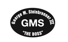
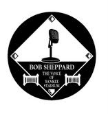
However, last night the Yankees released their designs for patches to be worn on their jerseys to honor “The Boss” and “The Voice”. The attached images of these patches pretty much sum up my argument; the Yanks had a simple, yet thoughtful design released within 24 hours of the news about George. Additionally, in my opinion, the tribute patch for Sheppard is the best I have ever seen on a jersey (and not even for a lost player or former player but for a voice.) The design of the Sheppard patch had an unfair advantage over the Steinbrenner patch as it was able to be planned out since Sunday, a whopping THREE days earlier.

When the Mets released their original Citi Field patch and were forced to step back and announce the “secondary patch” (which I love on my blue hat and would have liked to have on the jerseys for last season), they showed how little attention they pay to detail.

While I may be nitpicking here, I had to report to the “Police” that once again the Yankees showed the difference between themselves and everyone else…they KNOW what they are doing without having to follow the public opinion and KNOW they will end up looking good in the process. If only our team could keep it simple and get the easy things right, they could spend less time on damage control and more time on the things that matter!

Keep up the great work!
Chris

But Chris wasn’t done.

As a follow up, I was just reading the Daily News Steinbrenner pullout and took notice of all the ads from various businesses honoring George…one of the ads is from the Mets.

After seeing the “We Believe in Comebacks” ads and the other media they have used this season, I guess the Mets really did fire their former design firm or employees. Their ad in the paper today was very tastefully done with a darkened NYC skyline and a message “…saluting the legacy and memory of a New York sports icon.” I also liked the fact that they kept their logo (and Cyclones logo) small and aligned to the very bottom of the ad, away from the real message and the bold “George M. Steinbrenner III.”

Contrary to my previous email applauding the Yanks and “dissing” the Mets, I must say this time that this was a great job and a thoughtful tribute from the Amazins.

-          Chris

The Mets Police
Privacy Overview

This website uses cookies so that we can provide you with the best user experience possible. Cookie information is stored in your browser and performs functions such as recognising you when you return to our website and helping our team to understand which sections of the website you find most interesting and useful.