Meet the Mets,Tweet the Mets: The Story Behind a Winning Blogging Startup and Baseball’s Best-Wired Team – Forbes

Thanks to Tom Watson and Forbes for including the MetsPolice in an article that’s really about Matt Cerrone’s super accomplishments..but we are thrilled to be mentioned.

MetsPolice – the ultimate fan experience blog, which lobbied (successfully) for the return of Banner Day and more traditional blue and orange uniforms.

via Meet the Mets,Tweet the Mets: The Story Behind a Winning Blogging Startup and Baseball’s Best-Wired Team – Forbes.

@mediagoon ‘s twitter feed was also mentioned. The kid is starting to make the big time! And if you’re a tweeter and would like to follow me I am @metspolice.
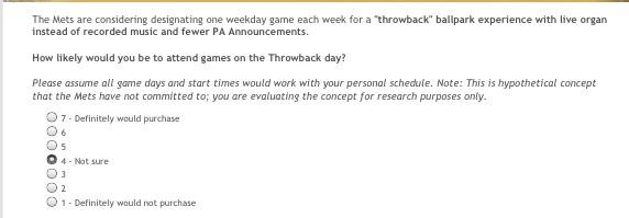
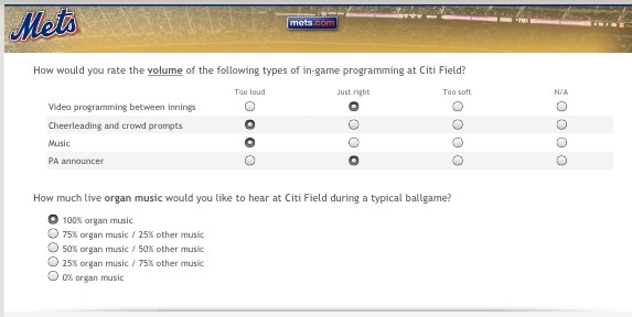
The Mets would like to know if you like 100 percent organ music. Would you?

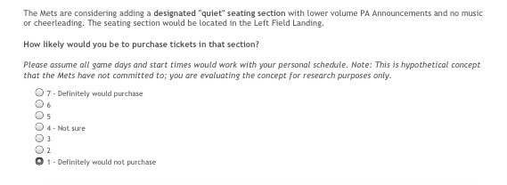
@TooGooden16 tweeted a survey my way. Shall we…

20120613-125404.jpg

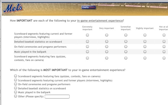
20120613-125456.jpg

Yay, I get to be a curmudgeon. I of course would love to see 100% organ music as a baseball game should have.

20120613-125637.jpg

I said no because section is more important to me than noise.

20120613-125757.jpg

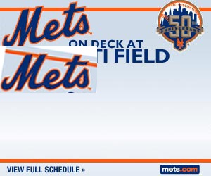
I love the idea of throwback day. However for me schedule is so much important. Remember the rants about Saturday+? I don’t want to go on Monday night. I like weekends. Have a throwback Saturday and now we’re talking!

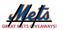
What’s up with the lopsided M in this Mets script?

I know some of you are aficionados (or actually whatever the opposite of aficionado is) of the Wilpon Script (read more here on Uni Watch).

The image below appeared in an email from the Mets yesterday. The M looks like it’s going to fall over.

I tried to put some lines through it (I have seen some of you graphics experts do that sort of thing) and I guess the M and the T line up nicely, but the left tail of the M is floating in air which is what I think causes the effect.

Thoughts? Comments?

Media Goon weighed in:

I think i figure out why it looks so off…..its flat. almost everytime the mets logo is seen it has an angle to it such as….

20120613-073129.jpg