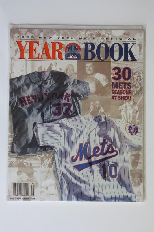
The 1993 New York Mets Yearbook Cover

Oh man, what the hell happened? I had such high hopes for 1992 and it was a disaster. Well, a new year has arrived and there’s no way it could be worse than ’92.

I mean they’d have to do something idiotic to the uniforms and lose 100 games for it to be worse….
13 Replies to “The 1993 New York Mets Yearbook Cover”

    1. Probably…The only time I ever considered not being a Met fan was due to these jerseys. Has anyone ever admitted to approving this travesty?

    2. Why, yes, I do believe you are.

      And it was only ’93 & ’94. The ’95 & ’96 unis rocked. ’97 gave us the ice cream caps, which was a prelude to the black plague.

  1. Sorry about that — forgot ’94 was the last year of them. How about this scenario: Mets bring the ’93-’94 uniforms back as the only home uniform. No black drop-shadow. In the process, they remove all hints of black from all Mets uniforms/logos/etc. Would you take it?

    1. Wow. That’s tough, and I may have to part ways with the Chief on this one. My initial reaction is to lean toward taking the swoop if it meant never seeing another dropshadow or black & blue cap.

      Sounds like an Impossible Poll to me….

  2. I find it ridiculous how much attention is given to Jeff Torborg as the poster boy for the 1993 Mets. He’s featured on one yearbook cover with the prominent stars of the team (with Bobby “I am still collecting a paycheck” Bonilla) and his jersey is featured on another. Was he a fantastic manager? Did he have a fantastic team?

    Putting it in today’s terms, can anyone out there imagine a current Mets yearbook featuring Jerry Manuel and not David Wright, Jose Reyes, Johan Santana, Mike Pelfrey? Come on…

  3. Actually the Mercury Mets is a desired jersey to add to my collection. Anytime Nick wants to part with his Izzy lmk..Of course guarnteed if a gamer ever popped up it would go for hundreds. Those turn ahead the clock jerseys are very desired amongst collectors. My favorite styles as everyone know 78-82 and 95-97..

  4. Some interesting comments on this one. I think I nearly shat my pants, though, over Shannon’s last post. That really surprised me — black over the underline. However, it’s moot since it’ll never happen anyway.

  5. I actually enjoy the cheesiness of the swoosh underline. I totally support it. But then again I support all quirky things of past days.

Comments are closed.