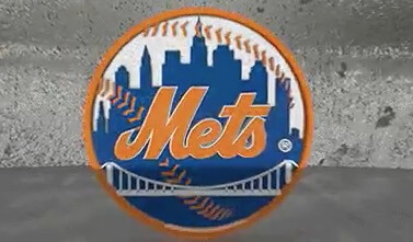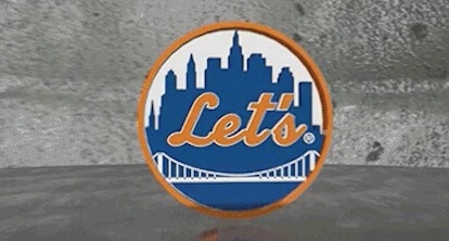
Let’s look at the S here. This is from a graphic the Mets have been using. The ball changes and says Let’s, then Go, then Mets. Now let’s look at the t and the s.
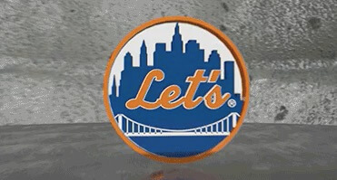
I kind of get that they had to shrink the T to get in the apostrophe. But why change the S? And why can’t the T connect to the S. I am not a graphic designer but I bet if I give Todd Radom 4 seconds he can solve this for us.
Also, I would have kept the ball lacing n Let’s.