I’m fired up today. Â Why? Because it is a lot of pressure on me to be the best driver in the tri-state area. Â Whereas you are content taking four hours to get from say Brooklyn to Queens, I am cursed with the ability to maintain 55 in the rain, and an innate ability to sense that my exit is approaching. Â (My eyes are able to see a shade of green called “SIGN” that many people cannot see.) Â I also have the ability to ignore whatever is happening on the shoulder or tying up traffic in the other direction…
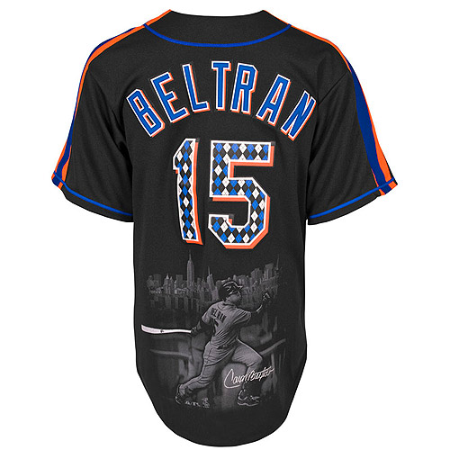
…so while I’m ticked off at the world, Matthew has to go and point out this to me…..here is Carlos Beltran’s fashion jersey and the official description from mlb.com
 Carlos went with true Mets colors, using the black, royal and orange. The front wordmark and back name and number are printed twill, printed with an argyle pattern inside of the wordmark and number. The sleeve shows the Mets team logo. Screen printed on the front of the jersey is a picture of Carlos chasing down a fly ball. Screen printed on the back is an image of Carlos hitting, with the NYC skyline behind him.
WHAT WHAT WHAT WHAT WHAT? Â TRUE METS COLORS??? WHAT WHAT WHAT WHAT WHAT?
A reading from the Book of Ruth, chapter 2.
Oh, the butcher and the baker and the people on the streets,
where did they go? To MEET THE METS!
Oh, they’re hollerin’ and cheerin’ and they’re jumpin’ in their seats,
where did they go? To MEET THE METS!
All the fans are true to the orange and blue,
so hurry up and come on down –
’cause we’ve got ourselves a ball club,
The Mets of New York town!
Give ’em a yell!
Give ’em a hand!
And let ’em know your rootin’ in the stand!
Come on and MEET THE METS,
MEET THE METS,
Step right up and greet the Mets!
Bring your kiddies,
bring your wife;
Guaranteed to have the time of your life
because the Mets are really sockin’ the ball; knocking those home runs over the wall!
East side,
West side,
everybody’s coming down
to meet the M-E-T-S Mets of New York town!
Of New York town!
I am off to go evaluate my feelings about who should play center field. Â Thanks a lot Matthew.
