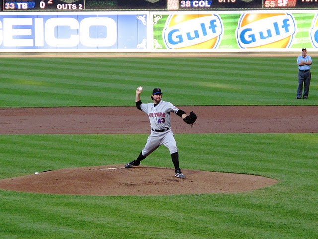
As I mentioned over the weekend this is a travel week for me, and could really use your help (send stuff to [email protected]) – the below started from the comment section.
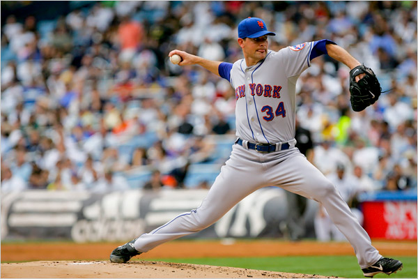
A few readers claim the Mets have not worn blue on the road since 1998 with one exception. Â Here’s the exception:
I defy anyone in the Mets organization to tell me that does not look better than the hybrid caps and the black socks. Â Go ahead. Â You can’t.
No way the black looks better. Â No way.
Anyone? Â Fellow bloggers? Â Readers?
After the description of the Beltran uniform last week that referred to black as one of the “true Mets colors” I told you I would escalate the war on black….
Fellow bloggers, throw me a link or write your own version of the story. Â This isn’t about trying to get traffic to the site. Â Readers tweet the pic.
DOES ANYONE THINK THE HYBRIDS LOOK BETTER THAN THIS?
Blue Caps only once since the turn of the century?
I have to go back to work…here’s the comments that started it. Â Grrrrrr. Â Oh and if they trade Seaver tonight for 5 scrubs I’m done.
Walt:
The Mets only wear black socks (belt and t-shirts too) on the road, and have since around the 2000 season. Though, they did go blue at Yankee stadium a few years ago, and I believe I read somewhere that MLB wasn’t happy about it, and may have fined the team(not part of their “official†road unis).
Ry wrote:
You are correct sir. I remembered it the same way and did a little digging, first on retrosheet to find the split doubleheader and then to UniWatch where I found the smoking gun. Since they introduced the black as a road uni color for socks, undershirts, etc, they have only worn blue socks and hats on the road once, as part of one of those weird Yankee/Shea doubleheaders on June 27th 2008. At the time, they made a point of saying that that particular uni combo had not been worn in 11 years. It’s too bad too, because it looked awesome.
here’s the times article from that game
here is the photo gallery…the 6th picture is awesome


shannon, why do they let players where there socks over there pants?? it looks idiotic and ruins the look of the uniform.
You’re kidding right?? Players do not wear their socks “over” their pant legs. They blouse their pant legs to produce a traditional high-cuff look. Those bulging things below the cuff and under the socks are called a calf muscles.
Chief,
NEVER apologize for your war on black…It is a color that IS NOT a Mets’ color and this is a war for the heart and soul of the team. Not to mention getting rid of the Dodger uniforms. I loved Howie Rose’s quote on the “power of the pinstripes”, because he gets it. Hey! Wilpon Family, go back to Mets’ uniforms…enough already. Win, and you will sell enough merchandise, stop worrying about that.
Pelf looks fantastic. Seriously looks amazin’.
Big Pelf would look better with exposed blue stirrups instead of the pajama bottoms.
That’s funny, I just looked at that photo gallery last night. I was hoping to find a photo of the blue socks with it. For some reason, I thought Delgado had them exposed that day. Hopefully there’s better photos out there.
The grey & blue is such a great look. I want to get a road jersey just to wear it with the blue caps.
Sorry to be the buzzkill against blue, but since black IS an official color (and has been for a score of years), the must use it in the colors of their uniforms. That means that they, at a minimum, must use it in either the road uniforms or the home ones. That they have chosen to use it in both likely is because the black merchandise sells. Although I think modifications could be made to make some of the black items look better, I am not for the wholesale elimination of the color, as I believe that it should have been an original color to begin with to more fully incorporate the New York National League’s Giant and Dodger past. In keeping with this philosophy, is black in the “True Mets” coloring? You bet! The incorporation of Yankee pinstripes, however (even if they were part of the original uniforms), I could most happily live without.
Again with the “Yankee pinstripe” nonsense. Pinstripes are a traditional baseball look. And, in 1962 pinstripes were worn by 9 teams,5 in the AL(White Sox, Indians, Twins, Yankees, and Senators), 4 in the NL (Cubs, Reds, Mets, Phillies).
Additionally, both the Dodgers and Giants wore pinstripes before the Yankees did.
But neither the Giants nor Dodgers kept wearing the pins past 1936 (1932 for the Giants and 1936 for the Dodgers). Moreover, although the Yankees have worn some form of pinstripes continuously since 1915 (95 years), the other teams you cite have not (the White Sox have worn them noncontinuously in 1912-17, 1919-20, 1925, 1927-28, 1932, 1951-68, 1971-75 and since 1990 (53 years); the Indians wore pins only in 1915-20, 1929-38, 1958-62, and lastly from 1970 to 1971 (20 years noncontinuous); the Twins did not wear the pins from 1972-86; and various incarnations of the Senators/Nationals wore pins only from 1912-25, 1928-35, 1948-67; In the NL, the Cubs have worn pinstripes 1907-1912, 1918-20, 1922-23, 1930-33, and continuously since 1957 (totaling 66 years); Reds have worn pins from 1914-31, 1958-67, 1993-2000, and 2004-05 (36 total years); Phillies wore pins 1921-23 and continuously since 1950 (for a total of 62 years)- http://exhibits.baseballhalloffame.org/dressed_to_the_nines/database.htm#database), thus the Yanks have a fair claim to the pinstripe tradition. For many teams, this “traditional baseball look” is not even traditional to their own team. Also, for good or ill, most people relate “New York” and “Pinstripes” to the Yankees (a vast majority likely, but mistakenly, relate “pinstripes” alone to the Yankees), so whether or not you believe that the Mets copied the Yankees in this regard, most people likely would have no problem doing so.
Other than the pinstripe belief differences, agree with your comments on this thread. 🙂
Michael, I must politely disagree. We took one color each from the Dodgers and Giants, that they were blue and orange and not blue and black was because the city’s flag is blue, white and orange. These colors are in honor of New Amsterdam’s Dutch founders. Watch the World Cup if you doubt me.
That doesn’t change that fact that Black is, and has been since 1998, an official team color
Last time I checked (and I don’t mean that sarcastically I mean the last time I was able to look) the official website did not list black as a team color. Obviously they have been wearing it.
I looked at mets.com, but could not find anything listing ANY official colors. However, @ http://ultimatemets.com/uniforms.html under the 1998 listing, they say that the Mets “Black is added to royal blue and orange as a third official team color”.
Respectfully, although orange is the official color of the Dutch royals (http://goamsterdam.about.com/od/planatrip/a/color_orange.htm), and hence the City of New York also adopting them in its flag’s color scheme, this is not the reason for the Mets adopting them. The Mets adopted the colors of the 1950s Giants and Dodgers (http://www.ultimatemets.com/uniforms.html). Truly, if you look over the timeline of both Giants and Dodgers uniforms from 1900 to 1957 (http://exhibits.baseballhalloffame.org/dressed_to_the_nines/database.htm#database), the Mets could have chosen from black, various shades of blue, red, green, and orange (in addition to uniform patterns varying from pinstripes to check to piping to without piping, etc.).
In my humble opinion, they should have included black in the original 1962 color adoption (and really could not have adopted the red the Dodgers also had since it was too close in color to orange) and its adoption in the late ’90s corrected this oversight.
For the “Mets purists” out there, perhaps the all-blue should be worn for home day games and anything with black for night ones. But, since it does seem that the official road uniform colors always include some version of black, I think you’re in for black undershirts and socks for at least the rest of this season.
offical color? please. its blue, orange and white.
AGAIN if we can have such a uproar against the black uniforms, then it must be said the same about the home outfield wall. I dont buy the black outfield wall does not bother me excuse. You make them a real dark blue and its will look as great as a road uniforms with blue cap, socks and t shirt!!
Don’t want navy blue, though. We’re not the Yankees.
Yes, Black is an official color of the NY Mets. Sorry, but it is a fact. And, despite your opinion of “such an uproar”, the Black jerseys are a top seller for the Mets. And, merchandise sales will always serve as a poll of fans opinions for the team.
{You’re kidding right?? Players do not wear their socks “over†their pant legs. They blouse their pant legs to produce a traditional high-cuff look. Those bulging things below the cuff and under the socks are called a calf muscles.}
whatever you wish to call it, it looks moronic and takes away the look of a tailored uniform apperance.
At least this traditional blousing look does not cause one to trip over one’s uniform as the unkempt pajama bottom look does – http://www.youtube.com/watch?v=99OeXRvf9y8 .
Black is brutal..and should be banned.
@mike. how can you call the pant legs tailored when the are all bunched up loosed and baggy at the heel of the sneaker? The first players to have their pants tailored from baggy to a tighter fit between the knee and and ankle were Willie Mays and Tito Puente in the 1960’s.
Tito Fuentes: timbale player for the SF Giants in the early 1970s.
That is a funny funny line.
media goon: there has never been a baseball player named tito puente…are you referring to the latin bandleader?
I vote we go back to flannels. much better look
@ ry I grabbed that off another site.it’s supposed to be tito fuentes
Blue Caps, Socks and undershirts on the road just kill the current look completely. That Pelfrey shot from that Yankee game again diffuses any argument supportive of the hybrid look. Ban it/Can it! Blue and Orange all the way!
Hybrid isn’t my favorite, but wouldn’t have minded a solid black cap with black undershirt and socks.
..and would also prefer stirrups and sanitary socks (perhaps with some stripes of blue and orange on them)were mandatory, do away with the pajama bottom look Pelfrey has above.
I think they should have two main uniforms:
Home: blue hats, pinstripes with creme background, no black anywhere.
Away: black hats, black Mets shirts.
That way, everyone is satisfied. A little variety. And that combo for the away is good.
No ‘hybrid’ hats. It’s ingenious looking design, but I have yet to see it look good on anybody.
The original hat is their best. I like the more recent revision of it, with the orange pin on top. And I’d like if the black hat had a blue pin on top.
Black should not be an official team color, but just another neutral background color, like white or grey.
Gregory I like your approach. It is a reasonable compromise ev en though it may not please me personally.