Here on Mets Police we’ve been talking a lot about the black uniforms. Â Here’s a really interesting guest post that possibly gives some insight behind the scenes. Â I have removed the name of the marketing executive that Brian says he spoke to and am calling the person Casey in this article to act as a placeholder.
Brian sent this to me last week but I am confident this will start a discussion in the Metsosphere, so I saved it for the day after a day-off which is usually a good day to get such things noticed. Â You’ll see Brian references there having been three games so far.
With all things on Mets Police, this site is not news, just a fat guy in a basement sharing some opinions. Â I leave it to you to decide if you find the site reliable or not, and the Mets are always welcome to comment because we do aim to be fair and correct. Â Â I am [email protected] if something here is unfair/misquoted/inaccurate.
Hey Shannon,
First off, great meeting you with my father in the team store on Opening Day. Putting a man to the words was quite a pleasant surprise.
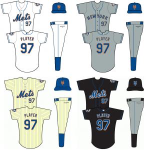
I wrote up my conversation with (Casey the marketing executive), about uniforms and have attached it. I also attached a version of your “compromise” so that readers could see how the set would all work (I just didn’t include the road black jersey, and you’ll read why in the post. Hope you enjoy and find some, most or all of it worthy of putting in the blog!
…
A Uni Conversation with the Mets
By Brian Erni
I approached the Mets unveiling of their cream colored alternates this year with much trepidation. As a die-hard fan and a bit of a collector (quite an understatement), I’ve been dying for the Mets to alter their uniforms to reflect their tradition, much as they did with Citi Field this offseason. The starting point? Ditching the black. So when news of a cream colored, retro pinstripe jersey started to leak throughout the Internet, I was excited. Here’s the chance for them to have at least one look void of any kind of black. Needless to say, the inclusion of the dropshadow aggravated me to no end. I wrote an admittedly melodramatic email to them venting my frustrations and was surprised when I got a call from (Casey the marketing executive) the first day back to work off the Thanksgiving holiday.
Our conversation began by me taking the defensive “I know uniforms seem trivial” stance, but (the marketing executive)Â assured me right off the bat not to look at it like that. (Casey) told me people feel very passionate about the uniforms and not to feel silly about it. (Casey) mentioned Howie Rose and Gary Cohen were both in (the) office right before the holiday because they’re both on the newly formered Mets Hall of Fame committee. (Casey)mentioned Howie noted how much he despises all things black in the Mets color scheme and Gary doesn’t really mind it. And thus: a differing of opinions that lead to offering an array of uniforms.
With that, we got down to business. Here’s a break down, arranged by topics:
The Black
Immediately, I started in on the black uniforms. (Casey) told me that I may be surprised, but those who don’t like the black uniforms are overwhelmingly in the minority. According to (Casey), they received a lot of positive feedback on the black uniforms in the May uniform survey. (Casey) did say that those who like the black are less enthusiastic about it, meaning: “Yeah, I like ’em” rather than those opposed, who REALLY hate them.
(Casey) did say that it is their number 1 selling jersey and the reason why they axed the black road uni last year was it created some customer confusion (which I took to mean: people come in, see two black uniforms and go, “they’re the same, but one says Mets. I want the one that says Mets.”) (Casey) did go on to say the black New York road alt constantly got overstocked because people who bought the black bought the home alt, so they decided to kill the road version. (Casey) also mentioned one of the reasons black is used is it acts as a “third color” for outerwear and other merchandising.
Analysis: Based on the feedback, what this says to me is that people who like the black uniforms like it because it’s different. I’ve always believed people who like the black enjoy it because it looks better in social situations, as in the enjoy wearing it to a bar because it looks more hip than a pinstripe jersey. Or it matches with more. Or it’s just a break from the norm. I’m not surprised that the existence of an alternate look helps the Mets sell more t-shirts and jerseys of course, but I thought it was interesting that she spoke about outerwear. Not really sure why the Mets can’t replace orange and/or white in the places they have black in their outerwear, but it’s of note that it came up.
Blue alternate jersey
Based on (Casey’s) comments about the black, essentially saying it sells well, but it doesn’t seem to be because of their overwhelming loyalty to the black color, I asked if (Casey) thought a blue alternate jersey may be a good avenue to explore? (Casey’s) response was a resounding no. (Casey) referenced the poor sales of the blue batting practice jersey. I immediately reminded (Casey) how low the visibility is for batting practice items probably suppresses sales—especially since the Mets have taken to wearing their snow whites during home spring training games during the last 3 seasons—and (Casey) agreed that it might be a factor, but insisted the market wasn’t there for a blue alternate top. I found that fairly surprising, but (Casey) said they had done extensive research on a blue alternate top and the interest just isn’t there.
Analysis: I don’t buy this for ONE SECOND. Look at the proof. All you have to do is a quick search on the Internet and it will turn up Uni Watch, the Chris Creamer discussion boards, MetsBlog, this blog and various other sources with droves of Mets fans who want to see a blue alternate jersey. Using the batting practice top as an example isn’t fair, as I noted, because if people invest in a jersey, most want it to be one they see the team wear every day. That’s not even going into the fact that the reason why most people scorn the BP jersey (and hats for that matter) is Majestic changes them every couple of years, essentially putting a shelf life on the jersey’s relevance. Their resistance to a blue alternate doesn’t make sense. Not only would it make them fairly unique (only the Royals, Rangers and Cubs have a solid royal blue alternate), but it would reboot the customer base on everyone who likes a solid jersey, but wants the latest. This one is perplexing, to say the least.
The new cream and dropshadows
I admitted that I had seen the cream alternate in person (at the time, this was a week after it was unveiled) and that it looked gorgeous, except for the black dropshadow. Now, (Casey)Â did make sure to tell me that they did specifically say it was “retro inspired” but I didn’t really let (Casey) off the hook.
I told (Casey)Â that I think I can speak for a lot of us when I say this: it’s not so much that the black exists. If it HAS to exist (because it’s so profitable) then I suppose it must. But WHY does it have to touch everything we have (i.e. why can’t we even have a throwback without it?!)
I said the jersey would be perfect without it and the dropshadow also infringes upon the road grays. (Casey) admitted to me that the snow white was (a) personal favorite uniform and asked me if I don’t like the dropshadow on the whites also. I told (Casey) I personally think all the wordmarks look better without the dropshadow, but it looks most egregious on the traditional Mets looks. We briefly discussed the NNOB issue, as some Mets fans wanted the retro uniforms to have No Name on the Back or NNOB, and I told (Casey) I didn’t mind names on the back of the throwback.  (Casey) referenced ’99 when they went NNOB and said they got a lot of complaints that they looked too much like the Yankees. I made sure to stress that I love the cream color pinstripe, because it IS a great idea. I told (Casey) I loved how the cream-tinted flannel that the ‘60s era Mets wore during the final Shea ceremony and at the ’69 championship reunion looked. The current incarnation just isn’t what it could be.
Analysis: I honestly think the Mets just misread the market here. Their idea was a good one, and as we saw on Opening Day, the cream pinstripes look incredible on the field. My biggest fear before the season was that the Mets would get sub par pinstripe sales this year and say, “Hmm that didn’t sell. Screw it. Kill the pinstripes.” But it appears the new pinstripe is a hot seller, at least from what I saw on Opening Day. And when I had my new cream jersey on in the stands, I got tons of questions of where people could buy them. A quick tweak of this is an easy fix and I know for a fact it would thrill most traditionalists.
The Charlie Samuels theory
I mentioned the popular belief that the reason the Mets wear black so much is because Charlie Samuels prefers it to blue, a notion (Casey)Â promptly shot down. (Casey) knows that belief is out there, but Charlie “likes what is clean.” (Casey) took this time to mention Rick Peterson and how what drove Charlie the most insane was when the Mets would be in blue caps and Rick, on a June day when it was 90 degrees, would go trotting out to the mound in his black jacket. Those instances led to the development of the second jacket in blue.
(Casey) said I would be surprised to learn how many players have opinions on which uniform they like. For example, (Casey)Â referenced Al Leiter and how he always wanted to wear black. (Casey) said Leiter wished the Mets ONLY wore black.
Analysis: WELL, as if the rumors about him having a hand in Kazmir getting traded weren’t enough to hate him, Al Leiter gives us another one. But this again, I’m not sure I buy. The Samuels theory is too rampant to be pure myth, but I do have to give him credit: thus far the Mets have worn the designated home uniform for the first two non “special†games. As we’ve said in the comments section, consistency is key. If he can use the black as an exclusive black Friday jersey, it’ll be a big step forward.
The black and blue hat
One thing I made sure to stress was my hatred for the “road” cap, which often makes its way into the home rotation. I said the WORST look is the snow whites with the black and blue cap. I told (Casey)Â even if the dropshadow remained on the gray uniform, it would be made instantly more tolerable by being worn with the blue hats. The black cap has sort of always been the bane of my existence. I told (Casey)Â since the black cap is technically a road cap, it should really stay a road cap if it absolutely has to be there. But I stressed my dislike.
Analysis: That hybrid cap has no place in the scheme. It’s ugly and it doesn’t serve a purpose. In the transition years of black incorporation (the Mets unveiled their black alternates in ’98, but did not include the all black cap until ’00), it made sense. But the all black cap essentially made the hybrid useless. Just look at it this way: does the black/blue cap make the snow whites better or worse? What about the roads? What about the pinstripes? If you answered no to all three (which you should have) it just proves that it has no place. Plus getting rid of it would likely end the run of those garish two toned helmets.
Misc.
We wrapped up the conversation by asking me about some seemingly random things, such as how we felt when they came out with the orange BP jersey back in 2003, I mentioned the former white outline that used to exist in place of the black dropshadow (the ’97 season I believe was the last year on that) and I even mentioned how the patch on the new “retro-inspired” jersey looks MUCH better than it had been in the past. (Casey) didn’t know of any changes to the patch (it’s truer to the original patch. The Mets script is thicker and the orange baseball stitching is much better), so this could just be a Majestic quality change. (Casey) said if (someone) was going to take two things out of our conversation, it would be get rid of the drop shadow and the black/blue cap. Quite frankly, that would be one giant leap for mankind, in my humble opinion.
So there it is. The full, dirty details. Now, I’m not 100% sure how all this added up to “get rid of the piping on the snow whites,†but who knows. Signs of encouragement: so far in 2010, we have yet to see the hybrid cap. I expect that will change when the Mets role into Colorado next Tuesday, but they should be given credit for going all blue in first three games of the year. The bad? It looks like a blue alternate is really on the bottom of the list. What will 2011 bring aesthetically? Who knows. But hopefully the Mets hear our words just like they did with Citi Field.
Shannon’s take:
I agree and understand that black works on civilian-wear. Â I don’t quite understand what a merchandise overstock has to do with whether or not 25-40 guys are wearing New York when playing on the road and dressed like a softball team. Â I also understand that people tend to want the team name not the city name…so why not go back to the late 70’s and have Mets on the road? Â The reason – it looks dumb and lazy that’s why.
Regarding black: Â even if black jerseys are a top seller, and black makes for nice outerwear, why the dropshadow?
As for the blue: Â I haven’t done any research. Â I’m just a fat guy with a laptop. Â If we want the team to wear blue then I encourage all of you to buy the blue jerseys that are on sale. Â In the team store you’ll find a blue Seaver and if I remember correctly a blue Strawberry. Â Let’s buy them!
I don’t know if it’s that the fans don’t like blue jerseys, perhaps they don’t like ugly blue jerseys. Â This year’s BP jersey would be a lot better if it didn’t have the underarm nonsense. Â That’s an MLB thing not a Mets thing – even though it has black in it it might make for good civilian-wear if it just looked normal.
The Charlie Samuels theory: Â I used to blame the pitcher, then a beat reporter (I forget which one) told me it was Charlie’s doing. Â Now I am confused. Â Charlie if it ain’t you I am sorry dude.
If you’re new to the Mets Police you may want to check out this post about last year’s uniform survey. Please note that article is formatted for this site’s previous design and I have not had a chance to modify it, so it’s a little ugly to look at but you’ll be able to follow it.
Looking back on the uniform survey, I see a pipingless jersey in slide 2, which matches the current rumor. Â I also see a darker version of the pinstripes – I guess a lot of people voted for that.
If you scroll down that article you will see that I apparently voted for the pipingless, so I have myself to blame. Â I feel like Captain Kirk just caused me to overload my memory circuits. Â Well, I give it out enough so you guys can pound me for that. Â I’m not going to be phony and change what I said a year ago, although apparently my opinion changed (and I do reserve the right to change my opinions, they are just opinions.)
Also of interest from the survey, the question about renaming the bridge did not include Shea as an option.
Maybe next week, I’ll take another look at the survey and break it down piece by piece.
By the way, I hear nothing but excellent things about Mets customer relations, and Media Goon posted another example last night. Â If you write a letter or email they call you back quickly and will engage you in a discussion. Â Good job.
We can all disagree on any of the topics we bring up here on Mets Police. Â It’s nice that we all do so in a civilized manner.
Above, Brian referenced me Revised Treaty of Flushing uniform suggestion I floated last week.  He also took the time to make the below uni-guide based upon the idea.

 Long time readers may be surprised to see me writing this. Â Heck, I can’t believe I am writing this.


